Crown Street, Wollongong, 2500

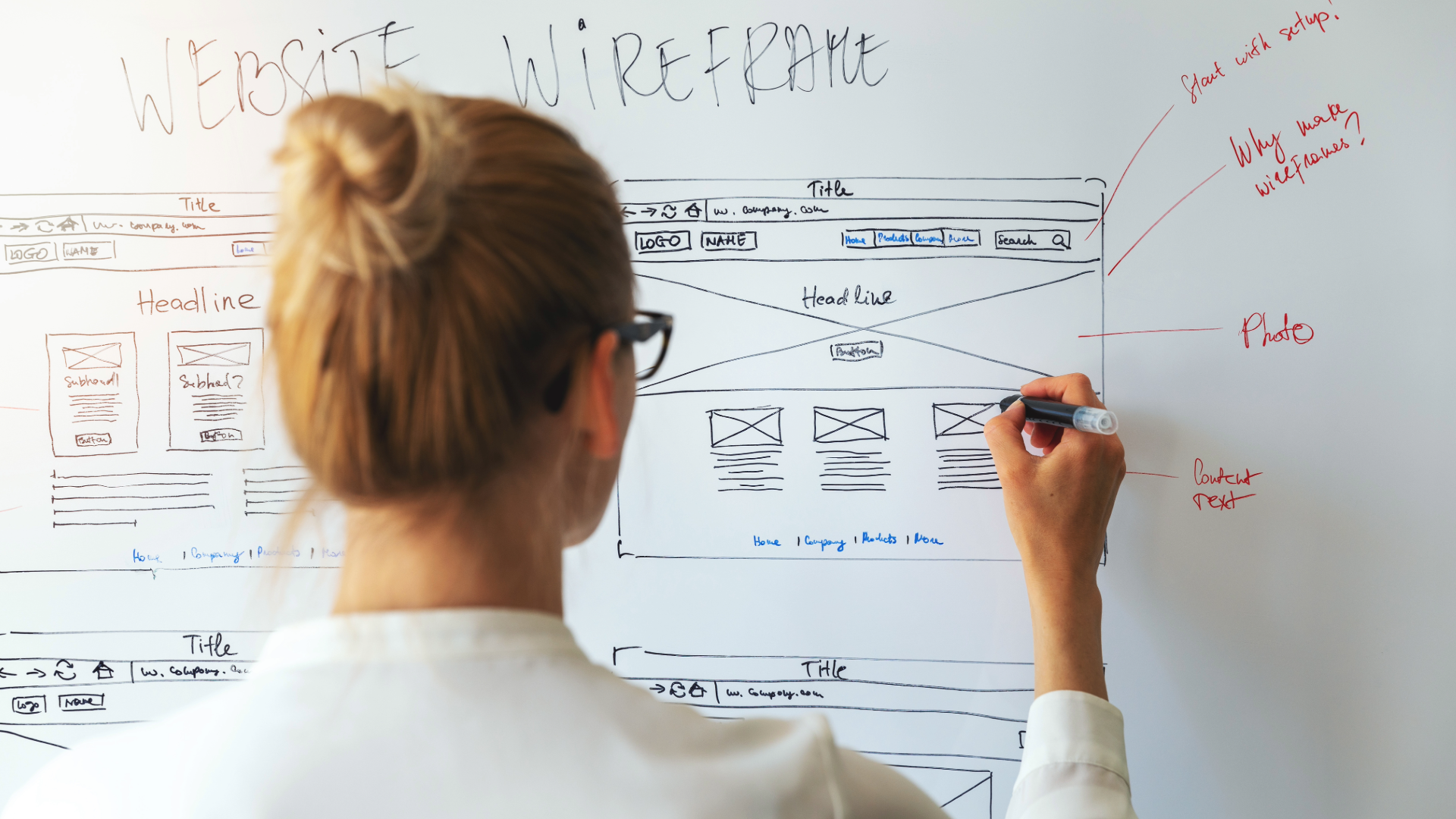
12 Visual Hierarchy Principles Used in Web Design
Melody Jaimon • March 10, 2023
Need to create the perfect website for your business? Love My Online Marketing is a bespoke web design agency in Wollongong. Whatever concept you have in mind, we can create websites that are not only visually-appealing but also represent your brand in the best light possible.
In today's digital age, websites serve as the face of businesses and organisations. With billions of websites available online, creating an outstanding user experience that can attract your site visitors' attention and keep them engaged is extremely important. One way to achieve this is by following visual hierarchy principles.
In this article, we'll discuss the different visual hierarchy principles that are used in web design and examine how we can create visually appealing and well-structured designs by effectively organising design elements.
What is the Meaning of Visual Hierarchy?
Visual hierarchy can be interpreted in different ways, but generally, it refers to a well-defined power structure that allows everyone to know which is the most important in the hierarchy of command. In design, visual hierarchy refers to ordering every single element according to its importance and relevance.
A visual hierarchy is a technique for classifying design elements based on their significance. In other words, it's a collection of principles that determine the order in which we notice the visuals.
Gestalt psychology, the 20th-century psychology school that laid the groundwork for contemporary perception research, describes visual hierarchy as a pattern in which some individual elements in the visual field tend to "stand out" or draw attention more noticeably than other specific elements, indicating a hierarchy of importance.
What is an Example of Visual Hierarchy?
More commonly before, the best illustrations of design hierarchy are seen in posters. Just like what you see in large outdoor signboards, posters are typically enormous and placed outside of buildings where there is high foot traffic.
To ensure that their message was successfully conveyed, designers needed to abide by the visual hierarchy principles, when creating their posters - so that viewers got all the information in a clear and concise manner before they passed by.

Here is a great example to consider. Yes, there are some good design elements. But where do you look first? There is a big element that says "Sale" with a matching summer theme and images indicating what the poster is all about.
To help the poster better convey its intended message, a visual hierarchy is applied. Besides the word "sale" being larger among the other elements, the colours, patterns, and alignment of the whole design was also balanced.
We can understand now that the poster was intended to get people to buy their products because there is a summer sale, while adding a call-to-action below to proceed shopping.
What are the 12 Visual Hierarchy Principles?
Users are more likely to trust a design and a brand when the page's visual hierarchy effectively conveys the significance of various design element and allows users to use the website easily. An effective visual hierarchy should follow these principles.
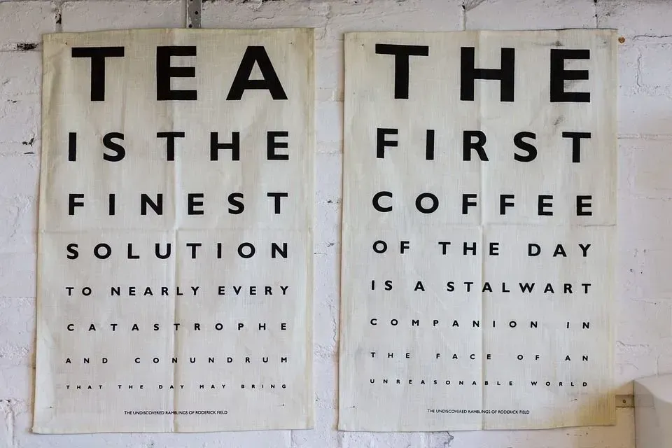
1. Size and Scale
It is no brainer that larger elements attract more attention. Therefore, the main elements of a design should consist of the elements that you want to be read first. Headlines and call to action should come in bigger elements while the body text and supporting material should come in smaller elements.

Undoubtedly, size is the best technique to draw attention to visual aspects. It is also for this reason why most titles are written in a larger font size, with the most important stories typically having headings that are even bigger than other elements on the same page.
Larger elements, whether in the form of words or images, will always grab the viewer's attention and convey more importance in any design.
2. Color and Contrast
Bright colors stand out more than soft hues, which should go without saying. The visual hierarchy is lower for those lighter colors since they appear more subdued.
Even for minor elements like buttons or links, using different color combinations among subdued colors is an efficient approach to strengthen the visual hierarchy.
Bright colors and dramatically contrasting colors typically attract users attention more than duller colours, just as larger elements are viewed as being more essential than smaller elements.

In the above example, the entire background is black and white. To create a clear visual hierarchy, the designer instead decided to give one triangle, a distinct colour. Before you have even looked at the other elements, your focus was automatically drawn to the orange triangle.
This shows how critical it is to use visual hierarchy in adding urgency and importance to a design. If someone is interested enough, the viewer could take a closer look and read the supporting body text to find out more.
3. Typographic Hierarchy
Typographic hierarchy is a visual hierarchy principle that focuses on highlighting the importance of your content by using different fonts weights, sizes, and colours. Among other examples, bolding words is the most straightforward way to demonstrate this principle. We bold items in our writing to emphasise the words we want our readers to draw their attention.
The same is true for type handling; when we increase its font size or weight, it indicates that the material should be read with more emphasis than the rest of the other text.
Notice that the headlines in printed publications like newspapers and magazines are always printed in big, bold fonts because their goal is to stand out and pull readers in.
4. White Space
White space is a contentious design feature that clients frequently find unnecessary but designers adore. A simple yet crucial technique to draw attention and emphasise your most important content is to leave enough white space or blank space in the design.
This way, you are putting enough focus on which content must be portrayed as important. Looking into a different perspective, the visual hierarchy might lose effect if there is an improper spatial balance.
5. Patterns
F Pattern
Readers in the Western World most frequently use the F pattern of eye movement. Why? Because we read a book, a letter, or a web page exactly the same way - from left side to right along the top, we scan the page once more for each line of text until we get to the bottom.
Due to this innate propensity, designers frequently use the F pattern when creating text heavy pages, webpages and other graphics that mainly rely on text.
Z Pattern

On the other hand, designs created with several images are frequently arranged in a Z pattern. Since the brain processes visuals more quickly than words, readers can swiftly scan pages by looking across the top from left to right or vice versa, down the page diagonally, and then back up again from left to right.
Z-pattern layouts are frequently used on pages with minimal information. A perfect example would be the home page of a website. If you go into a Facebook page, for example, visitors first scan from the top-left to the top-right, making imaginary vertical and horizontal lines. This design imitates the path taken by the human eye when reading—left to right, zigzagging top to bottom.
6. Proximity
One of the most important principles of visual hierarchy is proximity. Proximity refers to how pieces are arranged in relation to one another. Simply put, readers may assume that two items are related if they are placed next to one another.
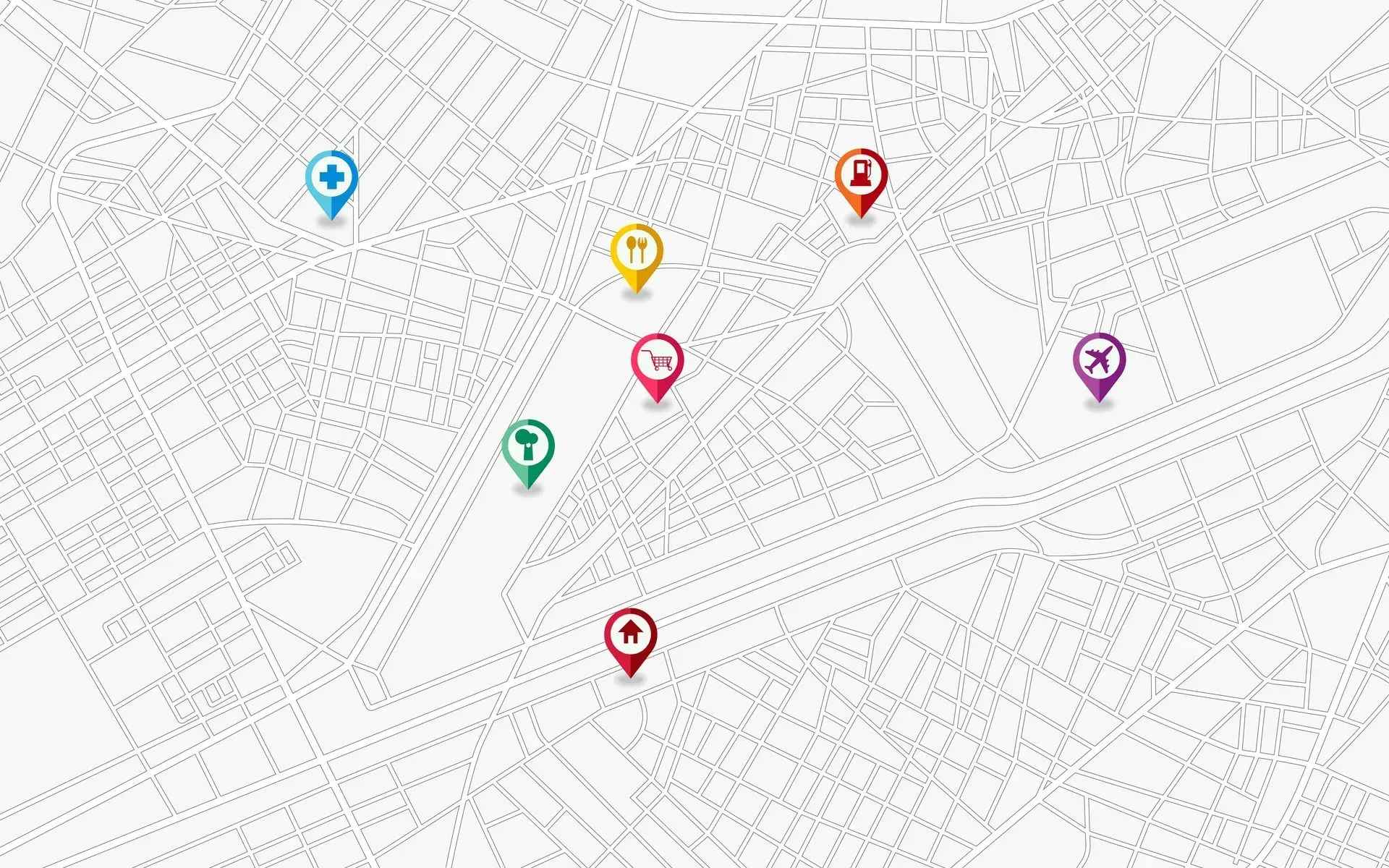
Arrangement of components in close proximity might also convey additional signals. For instance, positioning objects in specific positions on a map can help viewers comprehend how close or far something is. Of course, the size and scale of the map also play a role in this. Not always is an inch a mile.

Additional visuals and messages can also be produced by strategically putting certain elements close together. If the lines and curves are not arranged in close proximity, you may not possibly resemble a face in the example above.
The suggested image then often attracts more attention than its component parts. What do you see—a smiling face or three circles and a line?
7. Alignment
It could simply be just a little adjustment but alignment plays a very important role in establishing a good visual hierarchy. Whether your design contains text or graphic elements, they should not be placed randomly across a composition.
For example, a lot of graphic designs are justified or centered, which means they are dispersed over the page to share the left and right margins. If words were thrown across a page in every direction, it would possibly result in a chaotic scene.
8. Rule of Odds

The Rule of Odds is an effective visual hierarchy principle in drawing attention to specific images by centering them within a group of common patterns.
The most significant visual feature, which is in the center, is pointed out clearly by arranging nearby objects of the same size and number on either side of the main focal point, resulting in an odd-numbered group elements.
For instance, a group of elements is found to be more noticeable compared with only a pair of elements. If you will take a look at the example provided above, the focal point stands out from the rest because it was an odd out.
By isolating it among other elements or by creating an odd-numbered group, you are creating a design that draws attention from the viewer.
9. Repetition

Repetition enhances how a design is understood and recognised. By applying this principle, it can sometimes give elements a completely new meaning.
Repetition of a particular style throughout a website ensures consistency, which results in a unified web design. The visual hierarchy of any design is clearly defined by the repetition of too many elements, such as fonts, colors, shapes, or sizes throughout the entire composition.
10. Leading Lines
Lines are one of the most common and most used elements in graphic design. In visual hierarchy, not only are they used to connect two different points, but they are also used to draw the attention of viewers by leading them to a specific subject.
11. Rule of Thirds

The Rule of Thirds is a fundamental visual hierarchy rule that aids in directing the position and arrangement of objects in an image. According to this rule, when creating an image, the components must be arranged in such a way that there are three separate frames of reference - left, middle, or right frame.
In most cases, your subject should be in the left or right third of your image, leaving the other two thirds open.
12. Perspective
When looking at the majority of interfaces, including those seen on websites and mobile apps, you may see them mostly in a two dimensional perspective and frequently appear flat. By applying the principle of perspective, you may give the appearance of separation and distance between your elements, which will aid in drawing attention to the key components of your designs.
You can create the illusion of perspective by, for example, making certain components larger than nearby objects so that they appear closer to you.
What Are 4 Things That Affect Visual Hierarchy?
Visual hierarchy is typically impacted by the following factors:
1. Size
Users and readers notice elements more when their size is bigger than the rest of the elements.
2. Colour
The brighter or more vivid the colours are, the more they draw the attention of users than muted ones.
3. Contrast
Unlike repetition, which emphasises similarities, contrast highlights differences. By using contrast, an element can be easily distinguished from another.
4. Alignment
Alignment allows elements to be more organised and structured for better engagement. On the contrary, misaligned elements stand out over aligned ones.
What Does Having a Hierarchy Mean?
In web design design, having a hierarchy means using a number of fundamental principles, such as size, color, contrast, alignment, repetition, and brightness, to highlight particular aspects of the design. It manages certain elements to demonstrate their significance within the overall design.
Why Is Hierarchy Important in Design?
Visual hierarchy establishes the sequence of elements in a composition which is important for the viewer to understand the structure and purpose of the design. It helps guide viewers’ attention to specific elements, allowing them to quickly understand which is important.
Significantly, it has the ability to impact how the design is seen by the audience in terms of its value and whether it can be easily perceived. By creating a hierarchy in your designs, viewers are allowed to navigate through each element easily.
How Do You Use Hierarchy in Design?

Visual hierarchy is widely used in almost every design today. Particularly in web design and UX design, visual hierarchy is applied when designing a website, creating an advertisement, writing an article, editing a video, and many more.
By using visual hierarchy, designers and developers can structure elements sensibly to facilitate efficient visual comprehension.
This means that in a design, the header will be at the top in the largest font, and the size of other related elements will be placed subsequently according to their significance. This makes it easier for the user to understand the flow of the design, helping them decide where to look first.
How Do You Explain Hierarchy in Art?
In art, hierarchy is frequently applied to contrast visual aspects in a composition. Almost always, viewers are more likely to notice and recognise pieces of art that have the greatest contrast. By applying hierarchy in art, a viewer's processing of information enables him/her to navigate and assimilate information as intended.
What are the 7 Principles of Design?
The 7 principles of design serve as a guide for designers to create a visually appealing composition that is compelling and effective.
1. Emphasis
The principle of emphasis describes a design's focal point and the significance of each component therein. It helps designers outline their ideas and carry out the message that they want to convey to their audience.
2. Alignment and Balance
The balance of colours, size, and texture are all factors that are important in the overall weight of a design composition. Without balance, your audience will have a hard time understanding the main point of your design and where it is headed.
On the other hand, asymmetrical design uses opposite weights to create a composition that is not even, but is still balanced.
3. Contrast
The contrast principle basically creates separation and space between elements. Applying this principle, your background colour should be distinct to the color of your details in order for the other element to stand out.
4. Repetition
Repetition is an important principle that is relevant in creating designs that require repetitive elements such as pattern and prints. Repeating elements can create a sense of consistency and order, while providing a visual rhythm to the design that can help make it more appealing to viewers.
5. Proportion
The principle of proportion suggests that the various parts of a design should be in proportion to one another, with the size and scale of each element being relative with the rest of the elements to create a sense of visual consistency.
6. Movement
The principle of Movement manipulates a composition's elements so that the audience's attention is drawn from object to the next so that the message is conveyed effectively.
7. White Space
White space aids is essential in forming and organising a hierarchy within a composition. It signals our eyes that the objects in an area are separated with the components in another area.
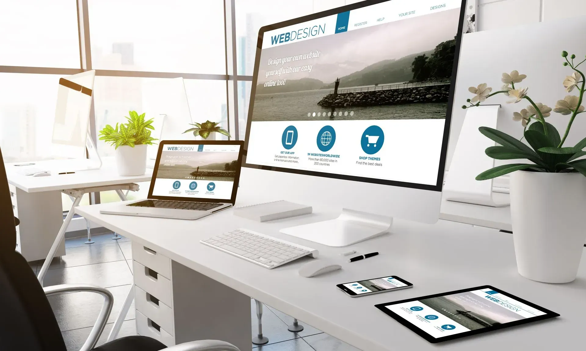
Why Is Hierarchy Important in Web Design?
Since it sets the significance and sequence of important key elements in a composition, visual hierarchy has to be taken into account in a web design.
Ideally, a web design should consist of dominant elements to set it apart from the competition. And a visual hierarchy has the direction to do it correctly.
For example, a web design for a mobile company will require a good visual hierarchy of the product and its features. In order to direct attention among users, you must create balance between what you will show and what you are trying to perceive.
Consider asking yourself a few questions to gain a better understanding of what important elements will you need to add to your design.
Are they making their debut with this app? The main features of the app will be introduced to them through a landing page. By creating a web design with an effective visual hierarchy, there is a greater chance that visitors will remain on the website for a longer period of time.
What Is Hierarchy on a Website?
Applying the principles of hierarchy on your website increases your chances of ranking higher on search engines. A good website not only makes it simple to organise the crucial components you should include on it, but it can also facilitate user navigation.
What Is Next Level of UX Designer?

The more skills and experience UX designers have, the more potential they have to progress in their careers. UX designers can rise to a more prestigious professional level. This can involve carrying on with practical UX Designer job responsibilities or stepping up to more difficult positions like Senior UX Designer and Lead UX Designer.
What Are the Four Quadrants of UX Design?
1. Experience Strategy (ExS)
Experience strategy is a tool used to create superior customer experiences that align with an organisation's goals and values. It does not solely focus on end users but it also helps companies achieve their objectives by creating a business plan that considers both the demands of the company and the customers.
2. Interaction Design (IxD)
The idea of interaction design involves observing how a user interacts with a system while taking into account all interactive elements, such as buttons, page transitions, and animations. Designing intuitive interfaces that make it simple for users to execute essential jobs and actions is the main goal of interaction design.
3. User Research (UR)
User research aids UX designers in understanding the needs of their target audience. To support this, UX designers will carry out surveys, interviews, usability testing, and create user persona in order to develop a strategy that effectively uses the qualitative and quantitative data they have collected.
4. Information Architecture (AR)
Information architecture is a critical element of any website design as it helps visitors navigate the site and access information easily. In choosing the information architecture to use for any given product, the relationship between distinct kinds of content is taken into consideration.
What Is UI Hierarchy?
UI hierarchy is a design principle used to organise elements in a user interface. It helps users determine where to focus their attention and what to interact with. UI hierarchy organises elements in such a way that is intuitive and easy to understand. It also ensures the most important information is highlighted first and that elements are easily accessible.
Why is Visual Hierarchy Important in UX Design?
Visual Hierarchy helps UX design to create a visual language that guides users through the interface and emphasises key elements for them to interact with. This can improve the user experience by making it easier for them to find what they are looking for and understand how the interface works.
Moreover, if you are creating a design and you give each element the same amount of visual weight, nothing in your design will stand out. Hence, your design won't work effectively especially if you are creating one for a UX design or an application. The goal is for users to easily find the content they want without your design being boring, which is why hierarchy should always be included in UX design.
Why Is Visual Hierarchy Important for Websites?
Basically, the sequence in which the human eye perceives is influenced by visual hierarchy. And we learn that in design, visual hierarchy must be able to:
- Create a visual structure
- Provide direction and emphasis, and
- Help viewers navigate and understand the information
It's simple to believe that adding as many elements as you can, can add a significant impact on a design. However, it doesn't work like that. Without visual hierarchy, websites won't be as compelling as they should be. So, if possible, you should make your title, headline, or logo bigger.
Bringing Visual Perfection to Your Web Design

Visual hierarchy is an essential aspect of creating visually compelling web designs. By applying the principles of visual hierarchy, designers can present a page effectively in such a way that directs the viewer's attention to the most important information first.
At Love My Online Marketing, we understand the importance of incorporating these principles into our website design projects. We believe that a well-designed website can make all the difference in getting conversions. By utilising visual hierarchy principles, we can create websites that not only look great - but also provide a seamless user experience throughout.


Love My Online Marketing has 10+ Years of working alongside businesses and helping them grow. Discuss your options for online success from website Design and Development through to Google Marketing.
Do you want more traffic and business leads?
Love My Online Marketing is determined to make a business grow. Our only question is, will it be yours?