Crown Street, Wollongong, 2500

Flex Overview (1.0)
Melody Jaimon • December 5, 2022
This article only applies to DudaFlex version 1.0 users. See
DudaFlex Overview if you started using it after
July 18, 2022.
What is Flex?
Flex is a new design option for sections and pages that are built on new inline editing technologies and flexible layouts such as CSS grid, flex, and improved alignment. Flex's breakpoints provide complete responsiveness and pixel-perfect precision for every element.
Flex is integrated smoothly into the current editor, allowing users to select when and where to utilise it. This means that Flex has all of the same advantages as our editor, but with even more design options.
Add Flex Sections
To include a Flex section, follow these steps:
- Hover between the rows and choose the Add Section button. Sections are shown in the side panel. You can also right-click to open the context menu, then choose Add Section.
- Click Flex Sections in the side panel.
- Click the Flex section you want to add, then click Save at the top of the page.
- The section to be edited is shown in Flex Mode.
See
Add and Edit Flex Sections (1.0) for further details.
Flex Mode Overview
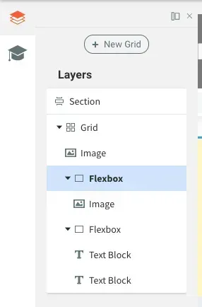
Layers Panel
The layers panel appears on the left side of the editor and displays the page's components (grids, widgets, flexboxes, text boxes, and so on). You can select, rearrange, and rename elements from this screen. The layers panel always begins with the section, followed by grids and widgets or containers.
Additionally, you can use the following methods to navigate between elements:
- Point to an element in the grid that corresponds to the element in the menu that appears above.
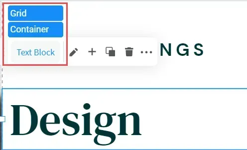
- Above the Design panel, click the breadcrumbs.
Design Panel
The design panel appears on the editor's right side and contains your design controls for the chosen element (container, flexbox, widget). Layout, size, alignment, and other design options are available.
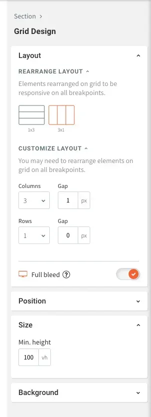
Design Panel Sizing Measurements
Flex provides numerous sizing measurements.
- Pixel (px). Every breakpoint maintains the same size.
- Viewport Width (vw).% of the element's width when shown on a specific screen. 10vw is equal to 10% of the viewport width. 100 vw occupies the whole width of the screen. Margin and widget sizes are set to % by default.
- Viewport Height (vh). % of an element's height when shown on a given screen On all screen sizes, 10vh is 10% of the viewport height.
- A. The size is decided automatically by the content.
- Min & Max. An element's smallest/largest measurement. This option guarantees that when resizing an element, it does not become smaller or larger than this value.
Alignment
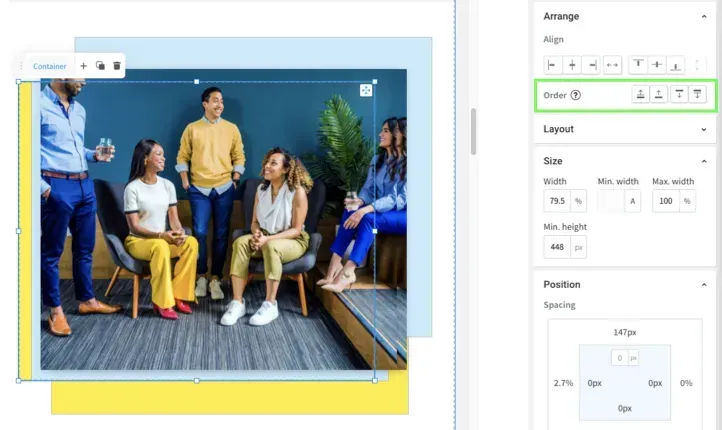
Arrange
You can reorganise overlapping objects in the Design and Layers panels by dragging the object below or above.
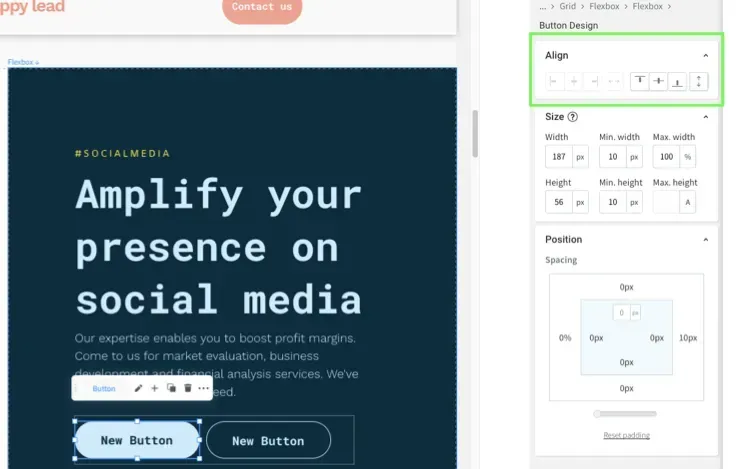
Flexbox Self-Align vs Alignment
The Design panel has two distinct automatic alignment settings for flexboxes.
- Select Vertical or Horizontal layout under Layout to set an axis for elements within the flexbox.
- Select how elements will be placed in the selected axis under Align in Flexbox.
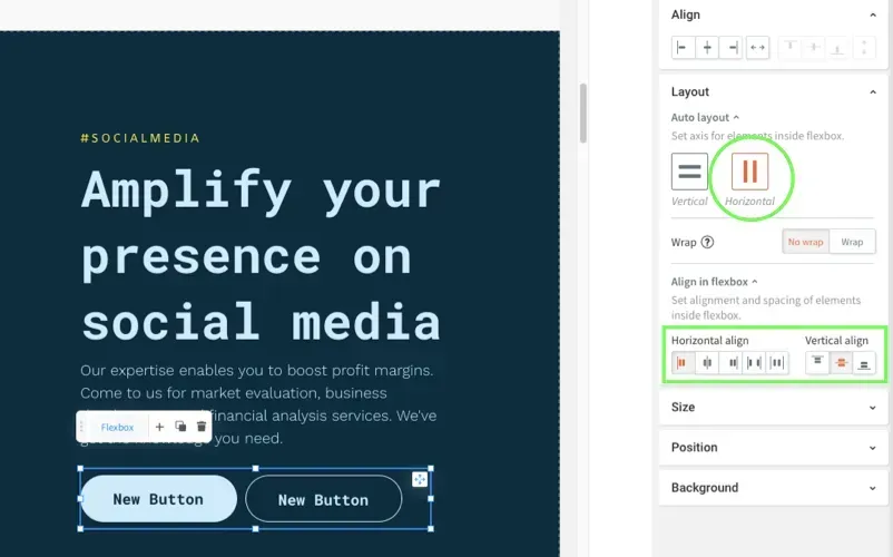
- Select how the entire flexbox will be aligned to the grid under Align. Only under the contrary axis can you align.
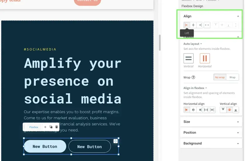
- Choose where an element inside a flexbox (such as a button) is aligned on the selected auto layout axis under Align.
Pin
You can pin elements to a certain position in a cell in the Design panel so that the location remains constant when the cell size changes.
To pin an element to a cell position:
- Scroll to Position in the Design panel after selecting the element.
- Click the arrow next to the Pin that corresponds to where you want to pin the element in the cell.

When the grid size changes the element remains pinned to this location in the cell.
Breakpoints
See Responsive Tablet for information on making your site responsive.
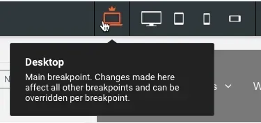
A breakpoint is a size at which the design adjusts to suit a specific screen width. Breakpoints allow responsive design since they scale up and down. The default breakpoints in Flex are:
- Desktop (1025px-1399px)
- Wide desktop (1400px and up)
- Tablet (768px-1024px)
- Mobile (767px and below)
- Mobile landscape (468px-767px)
By clicking the various perspectives at the top of the page, you can swap between breakpoints.
You can also conceal specific elements at specified breakpoints. See
Flex Breakpoints (1.0) for further information on breakpoints and how to hide elements.


Love My Online Marketing has 10+ Years of working alongside businesses and helping them grow. Discuss your options for online success from website Design and Development through to Google Marketing.
Do you want more traffic and business leads?
Love My Online Marketing is determined to make a business grow. Our only question is, will it be yours?


