Crown Street, Wollongong, 2500

Mastering Calls to Action: Strategies to Boost User Engagement and Conversions
Melody Jaimon • April 8, 2025
A Call to Action (CTA) is a prompt on your website that encourages users to take a specific action, such as "Sign Up," "Learn More," or "Buy Now." Effective CTAs are crucial for guiding users through the conversion funnel and enhancing engagement.
Why Are CTAs Important?
CTAs serve as directional cues, leading users toward desired actions and facilitating a seamless user journey. They can significantly influence conversion rates by providing clear instructions and motivating users to proceed.
Best Practices for Crafting Effective CTAs:
1. Be Clear and Action-Oriented:
- Use concise, imperative language that leaves no ambiguity about the action you want users to take. Phrases like "Download Now" or "Get Started" are direct and effective.
2. Ensure Visibility:
- Design your CTA to stand out by using contrasting colors and strategic placement. Positioning CTAs prominently, such as at the top of a page or after compelling content, can increase visibility.
3. Create a Sense of Urgency:
- Incorporate time-sensitive language like "Limited Offer" or "Join Today" to encourage immediate action. This tactic leverages the fear of missing out (FOMO) to prompt quicker responses.
4. Use Persuasive Language:
- Employ words that evoke emotion or enthusiasm, such as "Discover," "Unlock," or "Exclusive," to make the CTA more compelling.
5. Optimise for Mobile Devices:
- Ensure that CTAs are easily clickable and accessible on smaller screens, providing a seamless experience across all devices.
6. Test and Analyse Performance:
- Regularly conduct A/B testing on different CTA designs, placements, and wordings to determine what resonates best with your audience and optimise accordingly.
Determining the Optimal Number of CTAs on Your Homepage
The number of CTAs on your business website design homepage should align with your business objectives and the user journey. While it's essential to provide clear pathways for users, overloading the homepage with too many CTAs can lead to decision paralysis and reduce overall effectiveness.
Guidelines for Homepage CTAs:
- Prioritise Primary Actions:
- Identify the primary action you want users to take, such as "Sign Up," "Request a Quote," or "Shop Now." This CTA should be prominently displayed and easily accessible.
- Limit Visible CTAs:
- To avoid overwhelming users, ensure that no more than one CTA button is visible on the screen at any given time. This approach helps maintain focus and guides users toward the desired action.
- Incorporate Secondary CTAs Thoughtfully:
- If additional actions are necessary, such as "Learn More" or "Contact Us," place these secondary CTAs in less prominent positions. Ensure they complement the primary CTA without causing distraction.
- Consider User Experience:
- Design your homepage layout to facilitate a natural flow toward the CTA. Utilise whitespace, contrasting colors, and strategic positioning to draw attention without causing clutter.
- Test and Optimise:
- Regularly conduct A/B testing to assess the performance of your CTAs. Experiment with variations in wording, colour, size, and placement to determine what resonates best with your audience and drives conversions.
Examples of Effective CTAs:
- Dropbox: Utilises a simple "Sign up for free" button, emphasising ease of access and encouraging user registration.
- Netflix: Features a "Join Free for a Month" CTA, highlighting a risk-free trial and enticing users to subscribe.
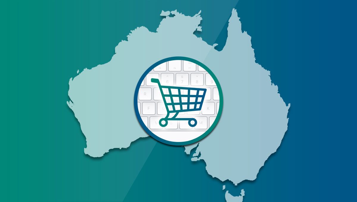
- Amazon: Employs "Add to Cart" and "Buy Now" buttons, providing clear directives for purchasing actions.
By implementing these best practices and thoughtfully integrating a limited number of well-designed CTAs on your homepage, you can effectively guide users toward desired actions, enhance their experience, and improve your website's conversion rates.
At Love My Online Marketing, we specialise in creating and redesigning websites that not only captivate audiences but also drive conversions through strategically implemented calls to action (CTAs). Our expertise in Google marketing ensures that your website is optimised for search engines, enhancing visibility and engagement.
Partner with us to transform your online presence and achieve measurable results. Contact us today at 0480 012 463 or visit our website to learn more about our services and how we can support businesses online.


Love My Online Marketing has 10+ Years of working alongside businesses and helping them grow. Discuss your options for online success from website Design and Development through to Google Marketing.
Do you want more traffic and business leads?
Love My Online Marketing is determined to make a business grow. Our only question is, will it be yours?