Crown Street, Wollongong, 2500

Exploring the 8 Gestalt Principles of Design
Melody Jaimon • February 17, 2023

As an integral part of our cognition and interactions with the world, our brains are naturally wired to recognise patterns, logic, and structure. Therefore, part of a designer's job is to conduct a vision research on design theories and principles in order to create successful designs for business materials.
One such theory that graphic designers and web design experts learn is the Gestalt theory, sometimes known as the Gestalt principles of perception and design. By understanding design principles, you will gain a greater insight into how they impact branding elements such as logos and websites.
In this article, we will look into the 8 principles of Gestalt Psychology and their roles in improving user experience when applied in today's visual system.
What are the Gestalt Principles?
Gestalt principles consist of ideas or theories that explain how humans perceive objects and how they combine similar elements, look for recognisable patterns, and simplify complex images as they see it.
These set of principles are typically used by designers on websites and other user interfaces to arrange content in a visually appealing and understandable manner. Basically, they are a set of principles that significantly enhances a design's overall beauty and usability.
What Gestalt Means and the Main Idea Behind its Principles
Originally, the word Gestalt came from a German word which means "grouping" or a "unified whole". Back in 1920s, Gestalt psychologists Max Wertheimer, Kurt Koffka, and Wolfgang Kohler developed the first Gestalt Principles with the goal of understanding how people normally derive meaningful discernments from the chaotic stimuli around them.

According to Gestalt psychologists, people instinctively perceive elements as complete patterns instead of just individual parts.
After further research, they discovered a set of laws, recognised now as Gestalt laws, that deal with the urge we all have to bring order out of chaos. This suggests that the mind "informs" what the eye sees by collecting individual elements and seeing them as a whole.
The Gestalt theory was soon embraced by professionals in the emerging field of graphic design. Since then, designers had a deeper understanding of Gestalt psychology and deliberately used the Gestalt principles to create compelling web designs with large images arranged in a strategical position, drawing the attention of viewers.
Why Designers Should Care About the Gestalt Principles

Perhaps too many designers fail to recognise the value of Gestalt psychology in the entire creative process of design today. In every aspect, Gestalt principles have undeniably influenced our daily design decisions whether they are for printed or digital media.
By nature, human beings tend to create a perceptual organization of visual information using our five senses and make conscious or unconscious attempts to give it a coherent, understandable meaning.
The ideas of the Gestalt principles as discovered by the Gestalt psychologists are successfully used in the area of User Interface (UI) in web design, allowing the information to arrive in a fun and engaging manner while directing the visual perception of it.
This serves to highlight how crucial Gestalt psychology is to contemporary design choices. An understanding of these Gestalt theories helps us come up with solutions that improve life for both designers and customers, whether we are creating art for a physical or virtual environment.
How is the Gestalt Principle Used in Graphic Design?
Gestalt principles have undeniably upped the game of design since they were discovered. Simply put, Gestalt principles have the ability to significantly enhance any design, be it for a website, a mobile app, a brochure, a card, or any other item that requires arranging design elements into a recognizable pattern.
Basically, through the help of Gestalt principles, designers were able to make their designs understandable, functional, and visually striking to draw attention of their target market.
The 8 Gestalt Principles and Their Applications
1. Figure Ground
Figure ground defines how the human brain attempts to visually distinguish between the focal point and the background. It is basically a type of perceptual grouping that recognises objects through vision. In Gestalt psychology, it is known as identifying a figure from the background.

Multi-stability is the propensity for ambiguous perceptual experiences to swing unpredictably between alternative interpretations. Hence, the mind tries to avoid uncertainty by trying to view a single picture with different components in multiple ways.
One of the common examples of figure ground principle include the famous "Rubin Vase" as shown in the example above. Looking at the illustration, which one do you see first? The black vase or the two people facing each other?
When looking at the Rubin Vase illusion, our human brain spontaneously switches between the faces and the vase. If you see the black vase, it indicates that your brain is looking at the rest of the picture as a white background. But if you are seeing two faces, your brain interprets the entire photo as a black background.
Depending on how the design was created, the figure ground relationship can also be complementary. This means that the figure and the ground can either be complemented or detracted from each other. Significantly, figure ground establishes the context for how your design communicates and is perceived.
As what Jan Tschichold, a German calligrapher and book designer quotes, “White space is to be regarded as an active element, not a passive background.” Hence, figure ground can be a useful design tool for generating visual tension, excitement, and interest.

In web or UX design, numerous techniques, such as dimensions, contrast, and physical proximity to other visual elements, are used to create a focal point.
As shown in the image above, the blue element which is the focal point stands out against all other design elements who are in the white background. Acting as the single visual feature, it immediately grabs the viewer's attention.
In the figure ground example, both shadows and vivid hues are present. The fact that the ground is still white makes it simpler for the figure to appear appropriately above it.
Overlapping objects are significant in using the figure ground principle to portray that the key elements in the positive space of the optical illusion is on top of the background. Hence, the shadow that was applied around the focal point draws our attention to another figure ground interaction that is present there.
2. Similarity
The similarity principle is clear and simple - objects that are similar or which have a similar aspect are perceived as one group.
It is a part of human nature to perceive like things as one. Following the Gestalt principle, similar elements will still be regarded as one group despite their proximity as long as they are visually alike.
Whether by form, colour, or shape, we like to arrange objects in similar ways. When we perceive items as being more connected than those who do not share features, this is known as the Gestalt principle of similarity.

On the example above, it is easier to identify elements when they are enlarged or coloured differently. Our acknowledgment of this norm is carried from one website to another by the similarity law. Although each site may use a different variation of this subject, the general pattern is remarkably similar.
In graphic design, the similarity principle is applied more frequently than you might imagine. Grouping objects together by colour to demonstrate their relationships or, omitting one element to draw attention to the other element.
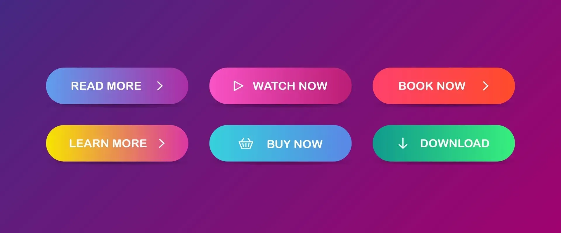
When designing websites, you might notice that call-to-actions are often different in colour so that they stand out from the rest of the page, leading the viewer to do the desired action. The same goes for a text link that is usually coloured and underlined.
All links and call-to-actions typically have the same format, so viewers can quickly understand their connection with each other elements. Therefore, similar elements are grouped by size, colour, or shape.
In other instances, similarity principle can also be used to group elements if for example, they are not in the same space.
3. Proximity
The principle of proximity states that our brains tend to perceive objects as group elements when they are in close proximity even if the objects' sizes, colours, or shapes vary.
The example above shows how the proximity principle works even though the circles had different sizes, they were still regarded as a group since they are close to the other elements.
The closer the elements are to one another, the more closely related they become. Combining elements that come from distinct groups results in a visual cluster that the brain understands as individual components of a complete image.
The only reason we can distinguish between two distinct groups of dots is due to their placement and proximity. We wouldn't recognize these dots as a group if they were hundreds of kilometers distant with each other.
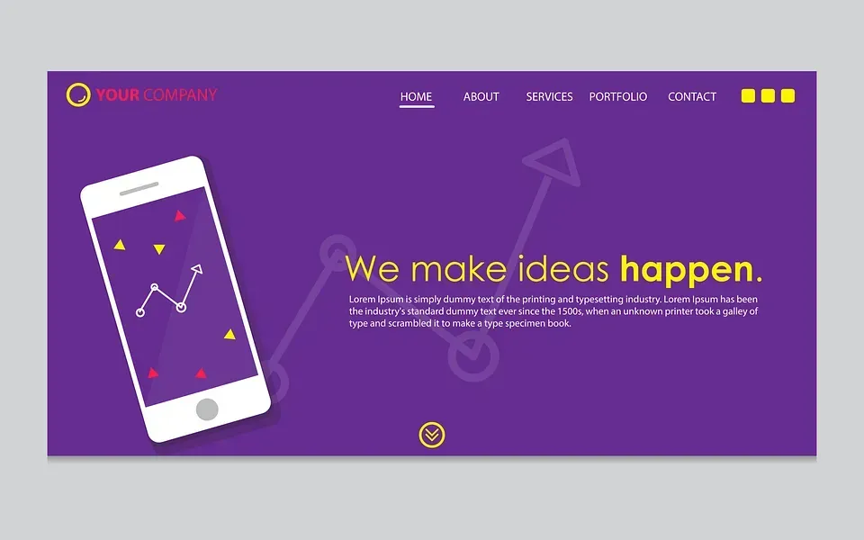
In web design, elements are frequently positioned close together so that we can tell right away that they serve the same purpose. Look at the example above. The primary buttons—Home, About, Services, Portfolio, and Contact—are positioned adjacent to one another and share a common format, indicating that they serve the same function.
By using Gestalt proximity principle and arranging like things closer together with a spacing in between each group, the audience will immediately recognise the organisation and structure you want them to see.
4. Common Region
Another Gestalt theory that designers makes excellent use of is the common region principle. As one of the main tasks of human perception, it is common to think of all the components as being connected if they all point in the same direction or are moving in the same general direction.
The common region principle is frequently used by designers to demonstrate how related information items are interconnected as well as the insertion of specific interruptions to emphasise a certain point.

The law of common region, asserts that we view elements put within the same visual container as a group. These principles govern how people instinctively perceive objects visually, including digital interfaces. Furthermore, we presume that each member of the group has a quality or purpose in common.
Designers benefit much from the law of common region as they can easily create relationships by using the same borders, backgrounds, and shadows in the same closed region.
In the Gestalt principle of common region, the objects are perceived to be part of a recognised shape are perceived to be present together. Time (shared fate): Things that happen at the same time or close together in time are considered to be in a group.
5. Common Fate
The common fate principle states that people perceive shapes as lines travelling along a smooth path. When two or more visual elements move in the same direction or at the same pace, people interpret them as one group.
Observing very carefully, the Gestalt principles of common fate and proximity may have a similarity but they are not completely the same.
The Law of proximity states that objects that are close or nearby one another are frequently seen as a group. Mores so, chunking or using perceptual grouping in elements makes it easier to scan information.
The Law of Common Region states that elements that share a region with a distinct boundary are more likely to be recognised as a group. This is ideally used when there is a negative space or a lack of space within the closed region only.

A flock of birds is a typical example following this Gestalt law. We typically presume that birds flying in the same direction belong in the same group. On the other hand, birds that fly in different directions will not be perceived as part of the said group.

Although the Gestalt principle of common fate is not included originally in the Gestalt principles, it was added in the UX design and is now being used frequently because of its functionality.
When it comes to nested menus and content, for instance, the law of common fate plays a significant role in design. Consider the case of the photo sample above. In order to establish a connection between the sub-menus, the web page applied the law of common fate.
The sub-menu item then advances in the same direction as the last one when you hover over a menu item. In the minds of the consumers, this establishes a connection between the sub-menus.
6. Continuity
The principle of continuity states that our visual perception prefers to go along a line or an object when it is in a continuous figure compared when it is in a discrete line.
Continuity essentially refers to elements with the same alignment that can still be used to create a new entity. For example, you can use squares to construct a rectangle. Since our eyes naturally follow those lines, components on the same line will appear more closely related to one another.

One of the best examples of continuity is a photo gallery thumbnail or an Instagram grid. Looking at the photo above, even though the grid is made up of discrete components, the continuity principle causes the viewer to perceive the grid as an entirely new image.
Individual elements tend to look unified as the eye moves along the many posts along the grid. Significantly, continuity makes the design more captivating because you have the power to guide your audience in the direction you want them to go.
All you need to do is figure out a technique to guide your viewers through a sequence of images or visuals that the people will naturally follow. Just like what this example above does.
When the intention is to lead a visitor's eye in a specific direction, this principle can be a useful tool. Make sure the most important information on the page falls within the simplest path so it's possible for them to follow.
Since our visual perception is programmed to follow lines naturally, arranging objects in a series along a line will cause the eye to naturally move from one object to the next.
When compared to items not on the line or curve, elements arranged in concave patterns are seen as being more linked. Good examples include similar product listings on websites and horizontal sliders.
7. Closure
The closure principle refers to the ability of the human brain to fill in the gaps and blanks. Through this Gestalt principle, designers are able to use shapes to generate images without actually creating the images themselves, leaving the spaces for the viewer's mind to fill in.
Because the eye fills in the missing visual information, closure does not require completely closed and finished shapes.
Designers only need to give the brain enough visual information to enable the mind to interpret the remaining information on its own since the human brain naturally discovers patterns.
According to the closure principle, when we examine a complex arrangement of visual components, our visual perception tends to search for a single, identifiable pattern. To put it another way, when you view an image with gaps in it, your brain will automatically fill them in to create a complete image so you can still see the pattern.
The closure principle basically divides up a larger sight into more manageable pieces by using a negative space.

In the given example, a partial image of a zebra is shown to fade off in the user's screen. The zebra's outline is missing large portions, but the human brain has little trouble filling them in so you can see the entire animal.
This is an important example of how closure principle is applied often in UX design. Without the partial image, our brains won't be able to create a recognizable pattern immediately, not noticing that there may be more to be seen.

You might not notice that some parts of this icon were missing because your brain has knowledge of what a fox looks like and our visual perception dictates that the missing parts were present.
The past experience principle, which we can relate to this example states that visual stimuli may occasionally be classed based on prior knowledge.
Applying the Gestalt principle of closure to design, absence of a partial image reduces the likelihood that your website user will scroll more on your web page.
Because consumers want to view the entire image that their minds have constructed, closure also works in web design. Users are more inclined to navigate to the next section of your website if you leave some of your elements just above the fold.
8. Symmetry and Order
Pragnanz, the German word for "good figure," is another name for the law of symmetry and order. As stated in the symmetry principle, the human brain is likely to interpret ambiguous shapes as simply as possible. Hence, there shouldn't be any visual cues that suggest something is off-balance, missing, or incorrect.
However, when something is asymmetrical, the viewer's visual perception focuses on spending time trying to solve the issue rather than focusing on the visual information presented.

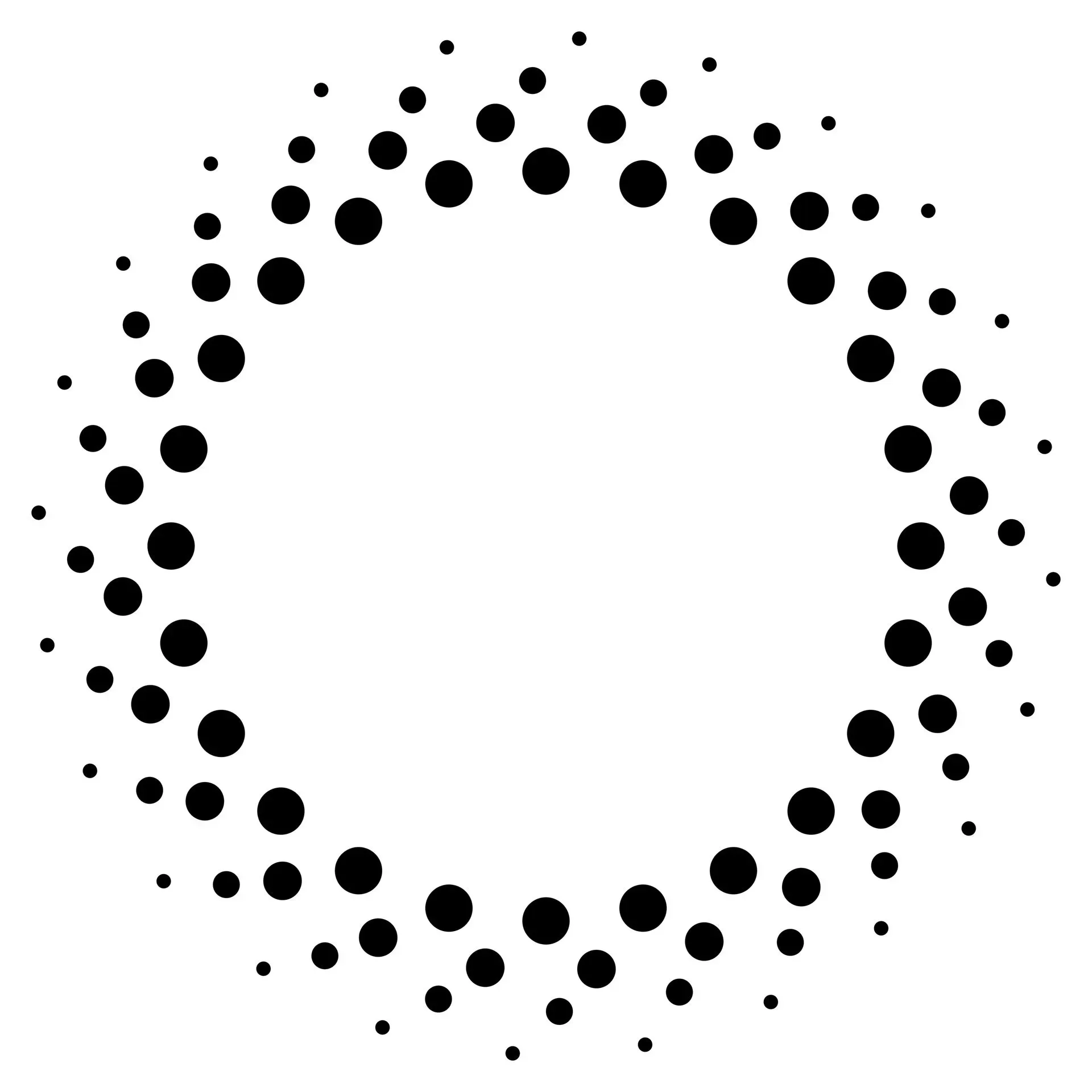
Applying the Gestalt principle of symmetry and order for this example, we view the image as a flower instead of seeing it as a collection of curved lines.
We often arrange symmetrical elements together, which enables us to create a recognizable pattern based on that symmetry to quickly organize the data.

In Gestalt principle of symmetry, items must be composed of equal parts in order to appear proportionate and balanced.
Looking at the example above as used in UX design, although the individual key elements do not have the exact similar size and appearance, they were arranged in a way that's proportionate with each other, creating a sense of uniform connectedness.
Takeaway
Incorporating the Gestalt principles of visual perception into design can greatly improve user experience. As you play around the different elements, you are creating a visual hierarchy that allows your business to stand out, gain more traffic, and increase sales.
At Love My Online Marketing, we ensure that we exploit the aspects of perceptual organization after learning how the human brain functions - so we can create a smoother visual language through our websites that instill a sense of comfort and familiarity to a user, even on their first visit.
Indeed, Gestalt laws can quickly convert a haphazard web design into a unified one, directing users to perform the desired action. Notwithstanding how simple they are, Gestalt psychology and its principles can be applied to almost any design.


Love My Online Marketing has 10+ Years of working alongside businesses and helping them grow. Discuss your options for online success from website Design and Development through to Google Marketing.
Do you want more traffic and business leads?
Love My Online Marketing is determined to make a business grow. Our only question is, will it be yours?