Crown Street, Wollongong, 2500

Flex Breakpoints
Melody Jaimon • December 8, 2022
Breakpoints Overview
Breakpoints are ranges of pixels that correspond to the width of various devices, such as desktops, tablets, and mobile. When a device's width falls within a predefined pixel range, the site's layout is modified so that the content and design are optimised for that device's size and orientation. On a desktop computer, for instance, I can see the whole site menu, however, on a mobile device I just see a hamburger menu.
This article only applies to users who began using Flex on or after
July 18, 2022. See
Flex Breakpoints (1.0).
Flex Breakpoints
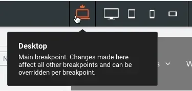
Flex's main breakpoint is the desktop. If you modify the desktop breakpoint's design or content, the modifications are immediately applied across the wide desktop, tablet, and mobile breakpoints. If you modify content, such as adding a widget, altering an image, or modifying text, the modification is immediately applied to all subsequent breakpoints, regardless of the breakpoint at which the change was made.
However, if you change the position or size of an element at specified breakpoints, the adjustments will not be applied to other breakpoints. Changing the size of an element at the mobile breakpoint, for instance, will only affect the mobile and mobile landscape breakpoints and no others.
The default Flex breakpoints are:
- Desktop (1025px-1399px)
- Wide desktop (1400px and up)
- Tablet (768px-1024px)
- Mobile (767px and below)
- Mobile landscape (468px-767px)
We advise verifying changes to the mobile breakpoint on a mobile device rather than resizing a desktop screen.
By clicking the several views at the top of the page, you can toggle between breakpoints.
Structural Changes
Changes to the structure made at each breakpoint influence all other breakpoints. When you make a structural change while on a breakpoint other than the primary breakpoint (desktop), a warning message informs you that the change impacts all breakpoints. Changes to the content or layout, such as adding or removing sections, columns, flexboxes, widgets, or complex grids, are examples of structural changes.
Hide on Breakpoint
Using the layers panel or the element's floating menu, you can conceal individual components at specified breakpoints. You can, for instance, hide a picture on mobile devices without affecting other breakpoints.
If you hide an element that contains other nested items, all nesting elements will likewise be hidden at the specified breakpoint. For instance, if you hide a flex column, the widgets inside that column will also be hidden.
To hide an element at a certain breakpoint:
- Click the view in the top menu to switch to the breakpoint where you want to hide the element.
- Click the element that you want to hide.
- Click the symbol with three horizontal dots () and choose Hide at this breakpoint from the floating menu. Or, in the layers panel, click Hide next to the element's breakpoint.
Breakpoint Overrides
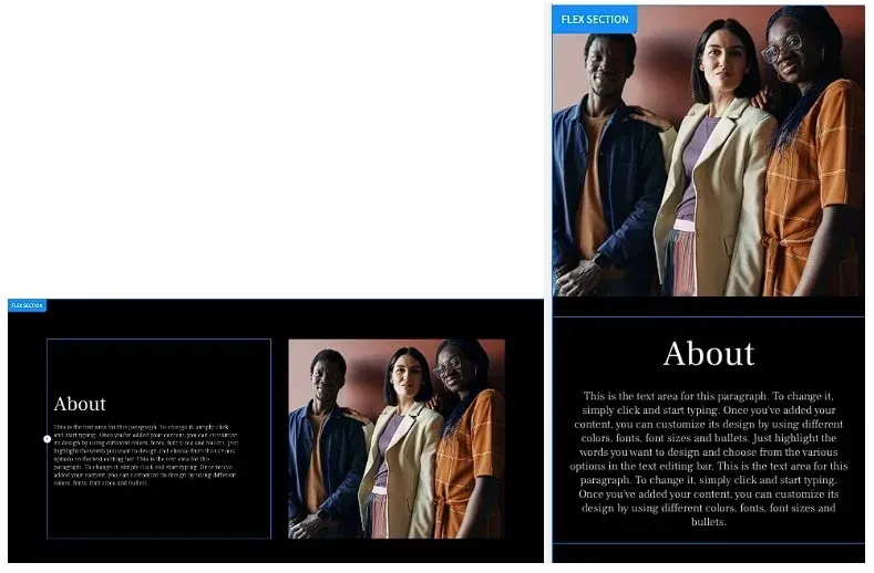
Changes to content can be made at any breakpoint, and they will affect all breakpoints. However, there are occasions when you must avoid a breakpoint. On the main breakpoint, an image appears to the right of a paragraph; however, on mobile, the image must appear above the text.
The following modifications may be made to an element to replace the primary breakpoint:
- Alignment
- Position
- Size
- Spacing
Once you override a breakpoint, you can't undo the change by changing the style in the main breakpoint for the same object.


Love My Online Marketing has 10+ Years of working alongside businesses and helping them grow. Discuss your options for online success from website Design and Development through to Google Marketing.
Do you want more traffic and business leads?
Love My Online Marketing is determined to make a business grow. Our only question is, will it be yours?


