Crown Street, Wollongong, 2500

Flex Design Panel
Melody Jaimon • December 8, 2022
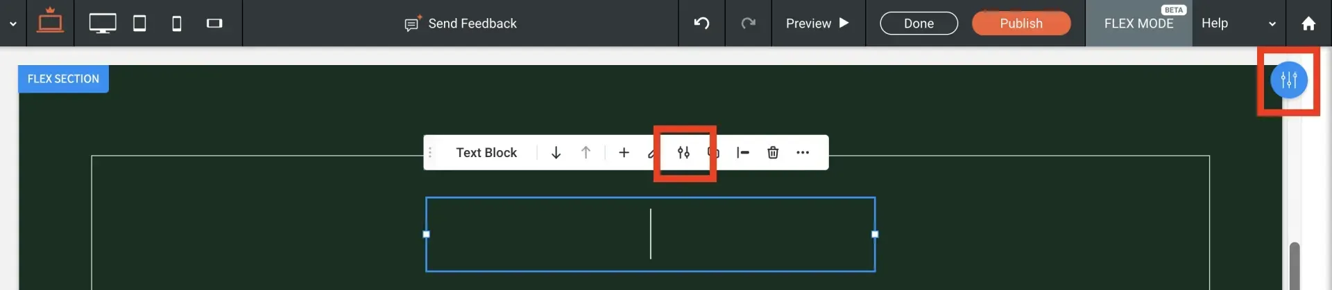
The design panel appears on the right side of flex mode and provides the design properties for the currently chosen element (section, column, widget, flexbox, or advanced grid). Each element has unique features that can be adjusted in the design panel, therefore the design properties vary based on which element is chosen. Depending on the element, the design features include alignment, arrangement, spacing, size, and more.
To access the design panel, right-click an element in flex mode and choose
Edit design. The design panel appears on the right side of flex mode, so it does not interfere with your ability to see and edit your design. Alternatively, under the floating menu, select the Edit design icon. After closing the design panel, you can reopen it by clicking the
Edit design button in the upper right corner.
Design Terms
The design panel uses the following terms and abbreviations:
- Px. Pixels are a unit of measurement that stays constant regardless of device size. For example, if a button is 280px in size, it will have the same size on mobile, tablet, and desktop.
- Vw. Viewport width is a unit based on the width of the screen (viewport) on which the site is being seen. For example, 10 Vw indicates that the element will scale to take up 10% of the width of the screen being seen.
- Vh. Viewport height is a unit based on the height of the screen (viewport) on which the site is shown. For example, 25 Vh indicates that the element will scale to take up 25% of the height of the screen being displayed.
- %. The element's percentage of the container (section, column, flexbox, or advanced grid). For example, if an element has a size of 10%, it will scale to occupy 10% of the container it is in.
- A. The height of the content determines the automatic unit of measurement.
Align
Available for individual items inside a column or flexbox. Single items inside a column or vertical flexbox with vertical auto layout may be aligned to the left, centre, right, or extended horizontally to fill the whole container width.
Elements can also be aligned from the floating menu by selecting the Align option and clicking the
Align
button.
Layout
Full Bleed
Only available for sections and can be changed only from the desktop main breakpoint. When enabled, the content may span the whole width of the screen. When the toggle is set to Off, the content width can be set to a maximum of 1,200 pixels. The full bleed option is set to Off by default.
See
Flex Breakpoints for additional information on breakpoints.
Align Elements
Allows you to align numerous components in a column or flexbox vertically at the same time. Elements can only be positioned individually and horizontally in the traditional editor. Vertical alignment is useful since it maintains the position of the items across all breakpoints without requiring extra modifications. See Flex Alignment and Spacing for further details.
Auto Layout
You can choose whether components within columns and flexboxes are positioned horizontally or vertically. Elements are vertically oriented by default. Elements may be moved only in the same direction as the auto layout alignment. If items are aligned vertically, for example, you can only move them vertically and not horizontally. The auto layout feature ensures that your design is optimal for every breakpoint.
Wrap
Only when
Horizontal
is chosen for auto layout are columns and flexboxes available. When
Wrap
is selected, components inside the column or flexbox maintain their size and wrap when the screen width changes.
Align Rows
Only available for columns and flexboxes when
Wrap
is set to auto layout. Sets the alignment of rows inside a column or flexbox. This option has no effect on the alignment of components inside rows, just on the rows themselves.
Spacing
Space Between Items
Allows you to adjust the distance between columns or widgets once and have it apply to all columns or widgets in a section or column. If the auto layout property is set to vertical for columns, the distance between widgets is measured in pixels. The gap between widgets is measured in percentages when the auto arrangement is horizontal. This feature does not apply to items included inside flexboxes or advanced grids.
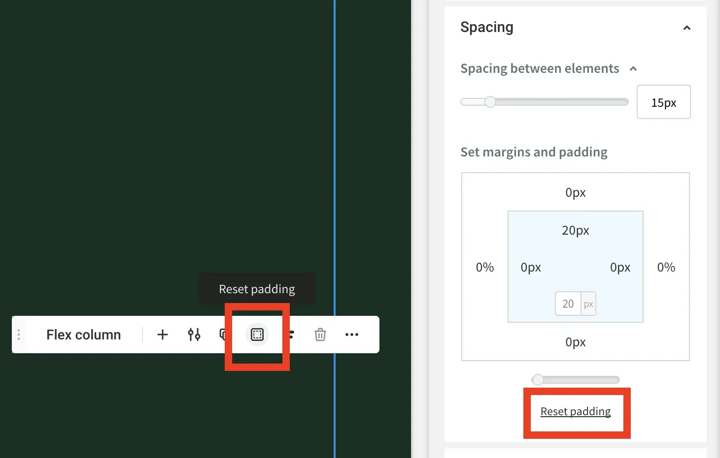
Set Margins and Padding
The gap between an element's border and the edge of the section, column, flexbox, or advanced grid it is contained inside is referred to as its margin.
The inside space of the element is referred to as padding. Click the margin or padding number to enter a new value, then use the drop down option to pick the unit (px,%, vh, or vw). Vertical spacing is specified in pixels by default, whereas horizontal spacing is recorded in percentages.
For example, if you select a column and change the left padding to 5 px, the space between the left border of the column and the outer edge of the components within the column will be increased by 5 px. If you set the left margin to 5 px for that same column, it will add 5 px between the border of the column and the edge of the section that includes it.
Reset Padding or Margin
It resets the padding or margins for the chosen element to zero when clicked in the design panel or floating menu.
Size
You can change the height and width, as well as the maximum and lowest values, depending on the element selected. Height may be measured in px, vh, %, or A in flex mode. However, flex column height and column spacing can only be measured in percentages.
Note
Each element's default size units are unique. Text boxes, for example, are 100% width by default, whereas buttons are 280px wide.
You can only change the height of sections. The device determines section width, but the Content Width parameter in Global Design determines section content width. Only the width of columns may be changed, but the height is determined by the section height or by its inner parts. You may choose the height and width of flexboxes and widgets, as well as their minimum and maximum settings. Any size unit may be utilised.
Animation and Background
In flex mode, the animation and background properties are the same as in the classic editor. See
Add Animations and
Customize Background for additional information.
Design Panel for Advanced Grids
Because of the flexibility to create freestyle compositions and overlapping components, advanced grids have design panel features that other element types do not have. We propose that you go through your design at several breakpoints.
Align
Because auto layout is not used, single components in an advanced grid can be aligned and extended in any direction.
Order
This property can only be utilised in the Arrangement section of the design panel when there are several items inside an advanced grid. You can move a chosen element to the front, ahead, rear, or backwards.
Create Overlapping Elements
in Flex for additional details.
Rearrange Layout
Allows you to arrange the columns and rows inside the advanced grid to build a layout.
Customize Layout
Select the number of columns and rows for your advanced grid using the drop-down options. You may also select the spacing between your columns using the
Gap
field. The distance between columns may be specified in pixels or vw, while the space between rows can be specified in pixels or vh.
Pin
Allows you to specify the location of the element inside the grid. When the element is set, it will remain in the same place even if the grid size changes.
Grid Location
Elements inside advanced grids that have been separated into columns and/or rows to form a layout are eligible. It displays the element's position on the grid.
Keep Proportions
When set to On, it guarantees that the components inside an advanced grid remain their proportions even when the grid's size changes.
Note
The Image widget also has a
Keep proportion option, which allows it to retain its original dimensions.


Love My Online Marketing has 10+ Years of working alongside businesses and helping them grow. Discuss your options for online success from website Design and Development through to Google Marketing.
Do you want more traffic and business leads?
Love My Online Marketing is determined to make a business grow. Our only question is, will it be yours?


