Crown Street, Wollongong, 2500

Is Your Website Helping or Hurting Your NDIS Business?
Melody Jaimon • March 13, 2026
Your website is often the first interaction a participant or carer has with your business. Before they call. Before they email. Before they decide if they trust you with something deeply personal.
Think of it like a first meeting in a waiting room. If the space feels confusing, outdated, or hard to move through, people feel uneasy. They may stay polite, but they will quietly look elsewhere. The same thing happens online, often within seconds.
Many NDIS providers do great work in real life but lose opportunities because their website does not reflect that quality. In some cases, the website actively pushes people away.
So the question matters. Is your website helping your NDIS business grow, or is it holding it back?
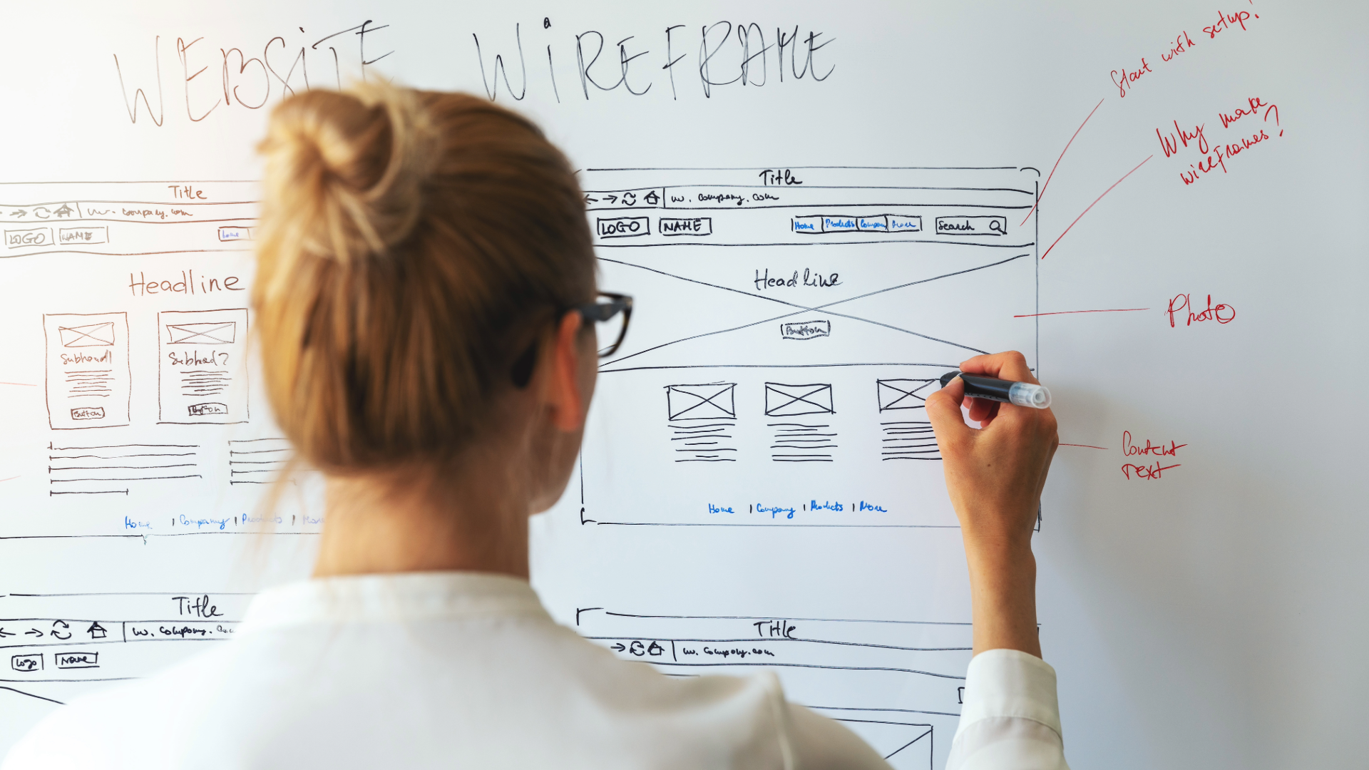
Why Website Design Plays a Big Role in Trust
NDIS participants and carers make careful decisions. They are not browsing casually. They are often under pressure, time-poor, and emotionally invested.
When they land on a website, they are subconsciously asking a few things straight away.
- Can I trust these people?
- Do they understand my situation?
- Is this provider professional and reliable?
Design has a direct impact on those answers.
A cluttered layout, poor spacing, or hard-to-read text can make a provider seem disorganised, even if the services are excellent. Stock photos that feel generic can weaken credibility. Missing information can raise doubt. This is often where an NDIS website redesign becomes necessary.
On the other hand, a clean layout, calm colours, and clear structure create reassurance. People feel guided rather than overwhelmed. They can see that the provider has taken care with how they present themselves.
For NDIS businesses, trust is not built through flashy visuals. It is built through clarity, consistency, and empathy. Good website design supports that quietly in the background.
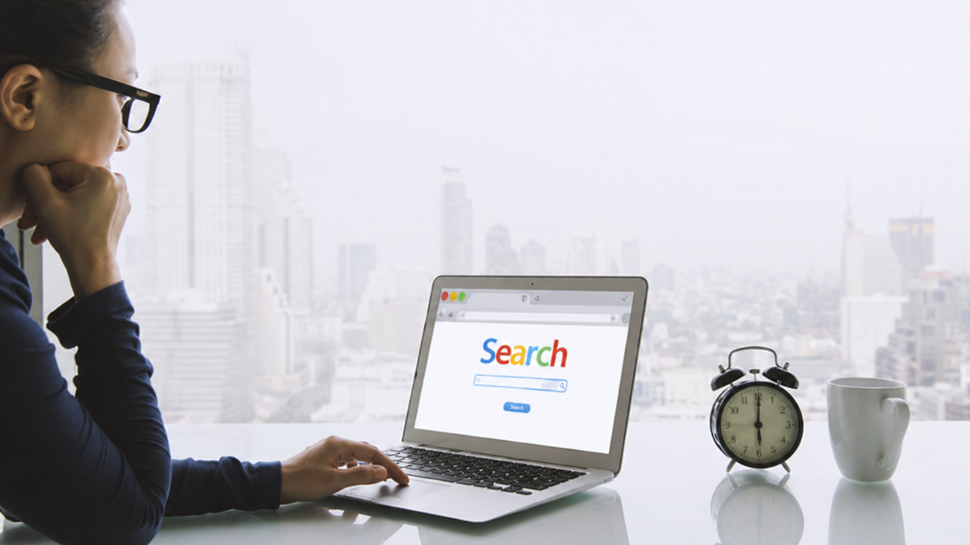
Understanding the Participant and Carer Mindset
Participants and carers usually research multiple providers before making contact. It is common to compare five or more websites in one sitting.
They are not reading every word. They are scanning. They look for signs that a provider fits their needs.
This is where many websites fall short.
Some focus too much on the business story and not enough on the participant’s questions. Others bury key information under long paragraphs or vague headings.
Clear headings, short sections, and plain language make a real difference. When people can quickly find answers, they feel more confident taking the next step.
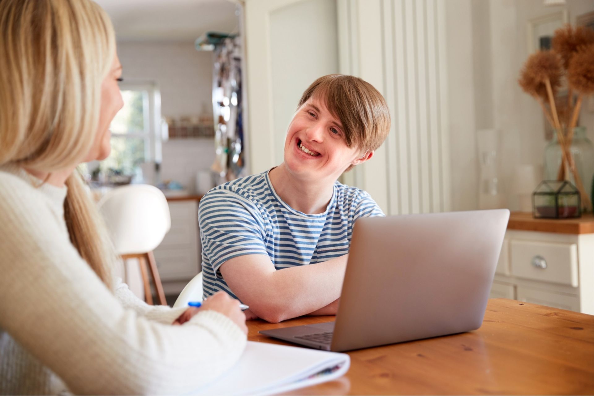
Accessibility Is Not Optional
Accessibility is not just a technical requirement. It is a direct reflection of your values as an NDIS provider.
If a website is difficult to use for someone with vision, cognitive, or motor challenges, that sends the wrong message. Even carers notice these issues.
WCAG accessibility guidelines exist for a reason. They help make websites usable for a wider range of people. This includes readable fonts, good colour contrast, clear link text, and keyboard-friendly navigation.
Accessibility also supports clarity. Simple layouts and clear content help everyone, not just people with disabilities.
An accessible website shows that inclusion is part of how you operate, not just something you mention in your services.
Load Speed Shapes First Impressions
Website speed is often overlooked, but it matters more than many people realise.
Slow pages cause frustration. On mobile devices, this frustration happens faster. Many users will leave before a page even finishes loading.
For NDIS participants and carers, slow load times can feel like a barrier. It creates friction before they have even seen your services.
Fast websites feel smoother and more professional. They respect the user’s time. They reduce stress, especially for people already managing complex situations.
Speed also affects search visibility, which means a slow website can limit how easily people find you in the first place.
Mobile Friendliness Is a Must
A large percentage of NDIS research happens on phones. Carers may be searching between appointments. Participants may be using tablets or mobile devices as their main internet access.
If your website is hard to use on a small screen, you are losing opportunities.
Common mobile issues include text that is too small, buttons that are hard to tap, and layouts that feel cramped. These problems create friction and increase drop-off.
A mobile-friendly website adjusts naturally to different screen sizes. Content stays readable. Navigation stays simple. Enquiry buttons remain easy to find.
This is not about trends. It is about meeting people where they are.
Clear Pathways Turn Visitors Into Enquiries
One of the biggest differences between high-performing NDIS websites and underperforming ones is clarity of pathways.
Visitors should never feel unsure about what to do next.
Clear pathways guide people through the site in a logical way. From understanding services, to seeing how support works, to making contact.
This means clear service pages. Straightforward calls to action. Contact details that are easy to find on every device.
It also means avoiding dead ends. Pages should link naturally to the next step, whether that is booking a call, filling out a form, or reading more about eligibility.
When pathways are clear, enquiries increase. Plan utilisation improves because people feel confident reaching out earlier, rather than delaying or abandoning the process.
Content That Supports, Not Confuses
Many NDIS websites try to sound professional by using complex language. This often backfires.
Participants and carers value clarity more than buzzwords. They want to understand what support looks like in real terms.
Short sentences help. Plain language helps. Real examples help.
Content should explain services in a way that feels human. It should answer common questions without making people work for the answers.
When content is clear, people feel understood. That emotional response is powerful.
Signs Your Website May Be Hurting Your Business
If your website has not been reviewed in years, it may be sending the wrong signals.
Low enquiry rates, high bounce rates, or feedback that people struggled to find information are all warning signs.
Another sign is when staff spend a lot of time explaining basic details over the phone. This often means the website is not doing enough of the heavy lifting.
A website should support your team, not create extra work.
Bringing It All Together
Your website does more than display information. It shapes perception. It influences trust. It affects whether someone reaches out or moves on.
For NDIS businesses, this impact is even greater because the decisions involved are personal and high-stakes.
A strong website removes friction. It supports accessibility. It builds confidence quietly and consistently.
A weak website does the opposite, even if your services are excellent.
If you are unsure whether your current website is helping or hurting your NDIS business, it may be time to take a closer look.
And if you need support with an NDIS website that reflects your values, speaks clearly to participants and carers, and supports real growth, reach out to us. We help NDIS providers create websites that work as hard as they do.


Love My Online Marketing has 10+ Years of working alongside businesses and helping them grow. Discuss your options for online success from website Design and Development through to Google Marketing.
Do you want more traffic and business leads?
Love My Online Marketing is determined to make a business grow. Our only question is, will it be yours?