Crown Street, Wollongong, 2500

Maximising Website Impact: Strategic Footer Design Ideas for 2025
Melody Jaimon • June 6, 2025
Most web designers obsess over the above-the-fold experience, hero sections, and eye-catching calls to action. But there’s a silent hero in website architecture that often gets overlooked—the footer.
Despite its importance, the footer is one of the most misunderstood and misused areas of a website. For many businesses and marketers, it’s just that strip at the bottom of the page—an afterthought, added hastily at the end of a web build. But this mindset is outdated, and it’s time we reframe how we view it.
In this blog, let's explore how footer design is transforming and how you can leverage it for maximum business impact.
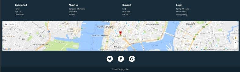
What Is a Website Footer?
A website footer is the section located at the bottom of a webpage. It typically remains consistent across the site and includes helpful links, legal disclaimers, and business information. It might not be flashy, but it’s functional, which sets great websites apart from mediocre ones.
Footers can serve multiple purposes:
- Directing visitors to important but less prominent pages
- Reinforcing brand credibility
- Offering legal and compliance information
- Improving site structure for search engines
Encouraging users to take action before leaving
Why the Footer Is More Important Than Ever
Your footer is the last thing a visitor sees on your page. In many ways, it's your final opportunity to leave a mark.
According to multiple studies on user behaviour, a significant percentage of website visitors scroll to the bottom, particularly when they’re looking for trust signals, contact information, or additional resources. What this tells us is simple: footers aren’t dead space—they’re decision zones.
In 2025, smart businesses are rethinking their digital strategies, making the footer a key player in delivering their message and deepening user engagement.
Emerging Footer Design Trends to Watch in 2025
Below, we explore the most forward-thinking trends shaping footer design in the year ahead.
1. Personalised User Interactions
The rise of personalisation in digital marketing is now finding its way into footer design. Instead of generic, one-size-fits-all layouts, websites in 2025 are integrating dynamic content based on user location, behaviour, or past interactions.
Examples include:
- Interactive maps that auto-populate the nearest office or store
- Smart chatbots embedded in the footer for instant queries
- Custom recommendations for blog articles or resources
These features help the user feel seen and supported, without requiring them to scroll back up or navigate away from the page.
2. Dynamic and Interactive Footer
Static footers are quickly becoming outdated. Forward-thinking brands are introducing motion, media, and interactivity to keep even the final section of a webpage engaging. Expect to see:
- Short video loops telling a quick version of the brand’s story
- Carousels displaying fresh content—like blog articles, podcast clips or testimonials
- Live social feeds embedded directly into the footer
This approach brings the page to life and keeps content feeling fresh, rather than fading into irrelevance at the bottom.
3. Clever Use of Visual Hierarchy
Rather than crowding everything into one block of small text, modern footers now use modular layouts to guide visitors naturally. These designs often include:
- Separate sections for contact info, legal links, and helpful navigation
- Bold headings to highlight important areas like sign-ups or support
- Subtle hover animations or icons to improve the user experience
This shift toward structure and visual clarity isn’t just about style—it helps visitors quickly locate what they need, improving usability and dwell time.
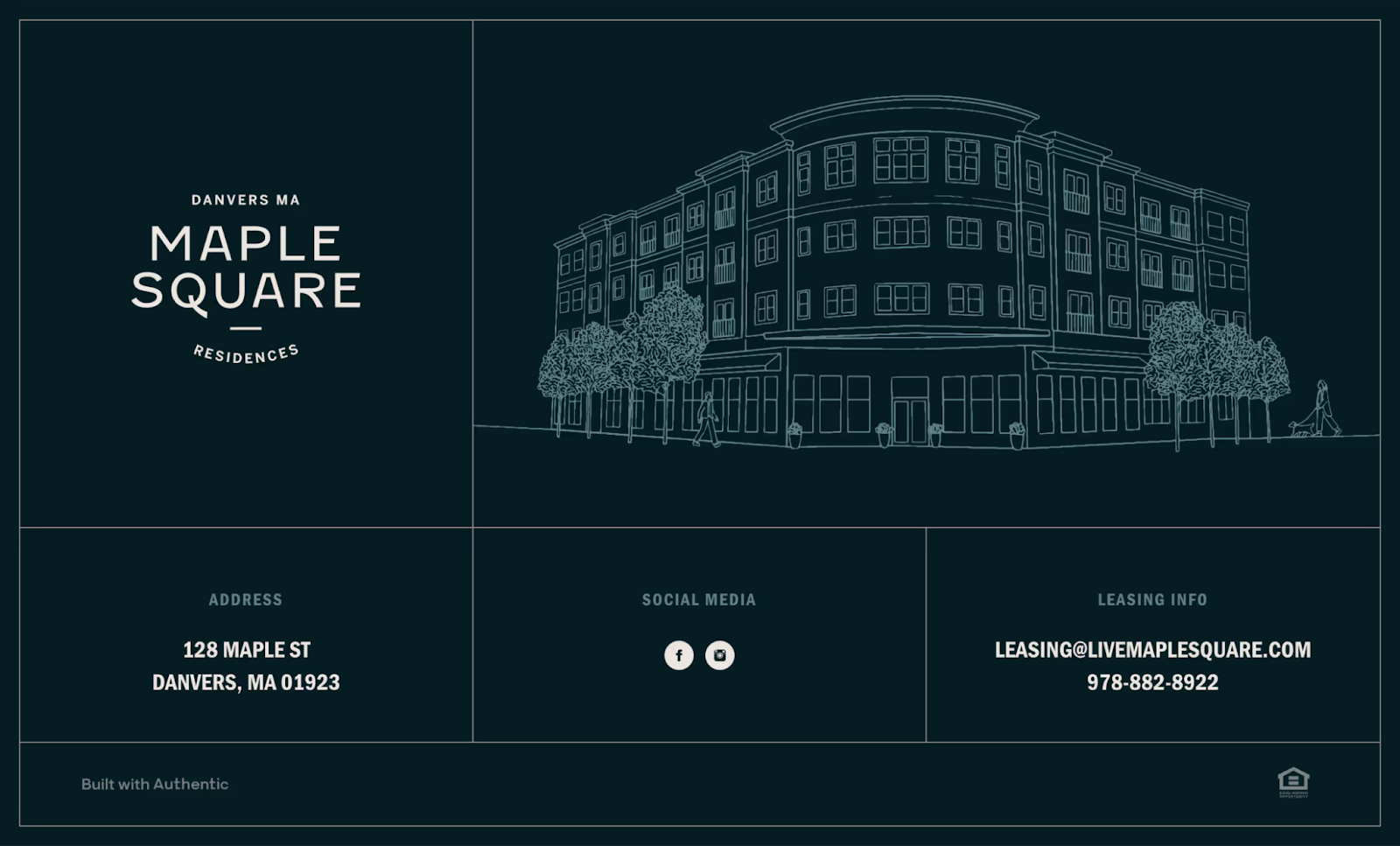
4. Visual Footer with Image or Video Backgrounds
Some brands are using the footer as a final opportunity to deliver a visual punch. You’ll often see this on sites related to travel, lifestyle, fashion, or real estate. The key elements include:
- A full-width image or video as a backdrop
- Overlay text with high contrast for readability
- A strong CTA, like “Book Your Stay” or “Join the Journey”
- An upward scroll button for easy navigation
This tactic leaves a lasting impression and reinforces branding right before a user decides whether to take action.
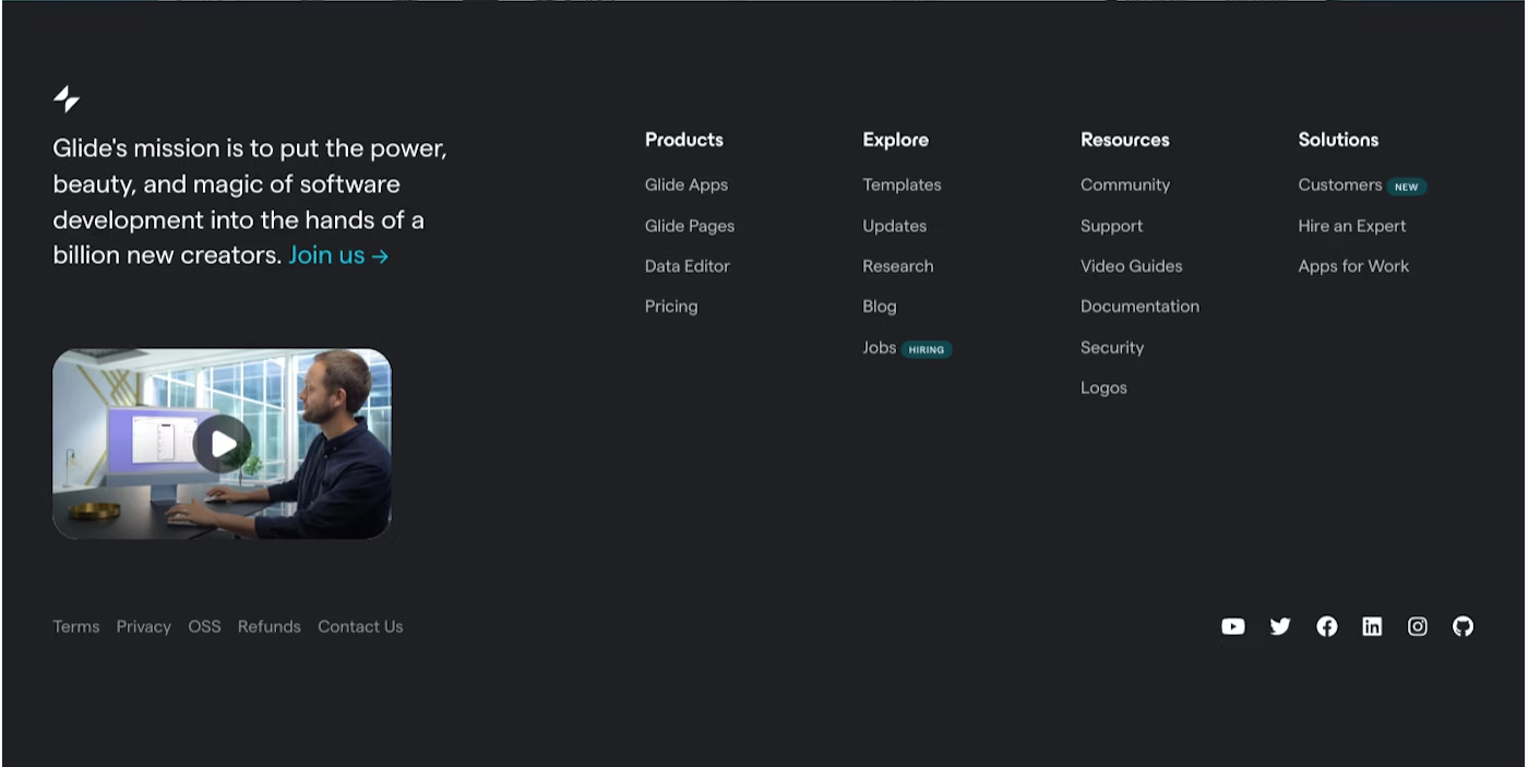
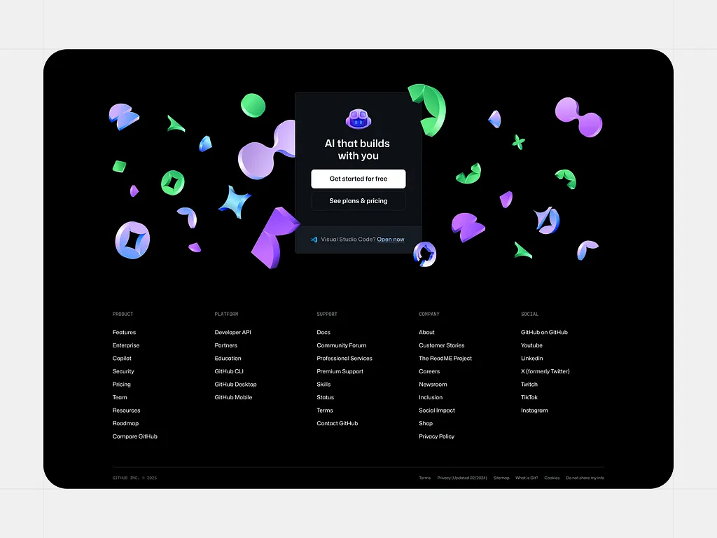
5. Mega Footer
Large websites, like e-commerce stores or educational platforms, benefit from what’s known as a mega footer—a wide, multi-column layout that allows more content without overwhelming the viewer.
These footers work especially well for:
- Organising large volumes of links
- Providing easy access to frequently visited sections
- Strengthening internal linking for improved search visibility
When thoughtfully designed, mega footers are like mini-maps that help users dig deeper without getting lost.
6. Smart Micro-Navigation
Footers are becoming secondary hubs for targeted navigation. Known as micro-navigation, this approach gives users a more intuitive way to explore deeper site content:
- CTA links grouped by persona: “I’m a small business owner”, “I’m a parent”, etc.
- Direct access to downloadable resources or support areas
- Curated link sets like “Most Popular Reads” or “Recent Case Studies”
This method keeps users engaged and lowers bounce rates by offering multiple points of interaction before they leave the page.
7. Brand Reinforcement
More brands are closing their pages with emotive, mission-aligned messaging. This might be a powerful one-liner, a heartfelt brand promise, or a witty statement that makes the brand feel more human.
These small touches help to humanise the brand, evoke emotion, and build memorability, right before the user decides what to do next.
8. Dark Mode-Optimised Footer
With dark mode now a built-in feature on most operating systems and browsers, websites need to account for footer legibility in both dark and light themes.
2025 designs are shifting toward:
- Adaptive footers with switchable themes
- Elevated contrasts between text and background
- Focus on iconography that remains sharp and accessible in both views
This not only improves visual comfort for users but also aligns with broader digital inclusivity goals.
A well-structured footer contributes to both search visibility and conversion performance.
Strategic footer design can:
- Help spread internal link equity across the site
- Reduce bounce rate by offering additional reading paths
- Encourage dwell time with useful resource links
For best results, footer links should include semantically varied anchor text, rather than repeating the same phrases. This boosts SEO without keyword stuffing.
When thoughtfully designed, it becomes a continuation of the brand experience—one that encourages trust, curiosity, and action. So, before you write off the footer as "just the bottom bit", consider the influence it could have in your next design refresh.
Common Footer Pitfalls to Avoid in 2025
As footers gain prominence as strategic touchpoints in modern web design, it's just as important to understand what not to do. Outdated approaches can undermine your website’s credibility and frustrate users—particularly in an age where every detail contributes to user experience and conversion.
Here are some of the most common footer missteps to avoid as we move into 2025:
Overloading with Excessive Links
Packing your footer with dozens of links—especially without logical grouping—creates clutter and confusion. Rather than guiding users, it overwhelms them. Focus on simplicity and structure. Group similar links, prioritise those that offer real value, and remove anything that doesn’t serve a clear purpose.
Illegible or Tiny Typography
Footers should be just as readable as the rest of your site. Using fonts that are too small or faint can frustrate visitors, particularly those browsing on mobile or with visual impairments. A footer with proper spacing, accessible font sizes, and strong contrast shows professionalism and attention to user comfort.
Repeating Main Navigation Content
It’s tempting to duplicate your top navigation menu in the footer, but this is rarely helpful. Instead, the footer should serve a distinct purpose—offering deeper links, support options, or calls to action that support the user journey without being repetitive. Think of it as a value-adding complement, not a carbon copy.
Overlooking Mobile Optimisation
With mobile traffic dominating the web, your footer needs to be just as functional and attractive on smaller screens. Avoid designs that don’t scale, force horizontal scrolling, or stack elements awkwardly. A responsive, mobile-friendly footer enhances usability and supports conversions, no matter the device.
Start Your Website Transformation Today
As we move into 2025, it’s becoming clear that the website footer is no longer just a space to dump legal links and contact details. It's evolving into a sophisticated area for engagement, retention, and conversion. Think of it as your final pitch—your website’s quiet closer.
By applying the latest strategic design ideas for 2025, you can turn this often-overlooked section into a high-performing feature that elevates your entire website experience.
At Love My Online Marketing, we specialise in transforming every inch of your website into something meaningful, functional, and conversion-focused.
Ready to upgrade your online presence? Let’s build a website that works today.


Love My Online Marketing has 10+ Years of working alongside businesses and helping them grow. Discuss your options for online success from website Design and Development through to Google Marketing.
Do you want more traffic and business leads?
Love My Online Marketing is determined to make a business grow. Our only question is, will it be yours?