Crown Street, Wollongong, 2500

Edit by Device
Melody Jaimon • September 14, 2022
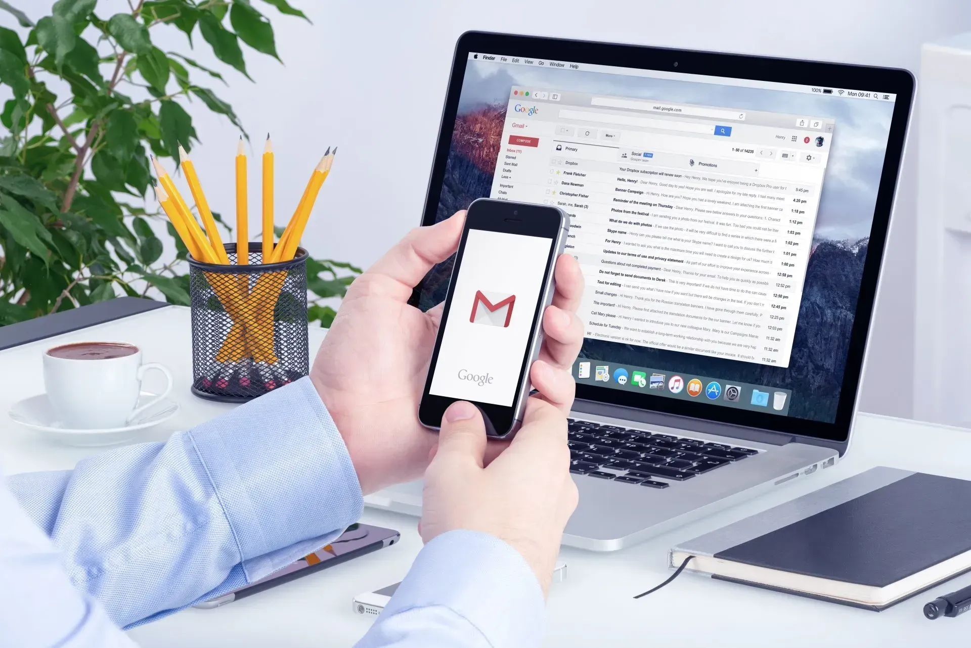
Edits made to one device are replicated on all the others. For example, if a row is removed from the tablet view of your site, it will also be excluded from the desktop and mobile views. This is because your site is responsive, allowing content to be shared across all devices. But you might want to make sure that different content shows up on different devices. You can use the edit-by-device feature and serve your visitors content that works with the device they are using to access your site.
Changing views is often needed when making changes to a specific device. Check out
Switch Views to learn more.
View Information Bars
Some widgets and features might only be available on some devices. To change how a widget looks on a certain device, click the device view on the top navigation bar to switch to that device view, and then make changes.
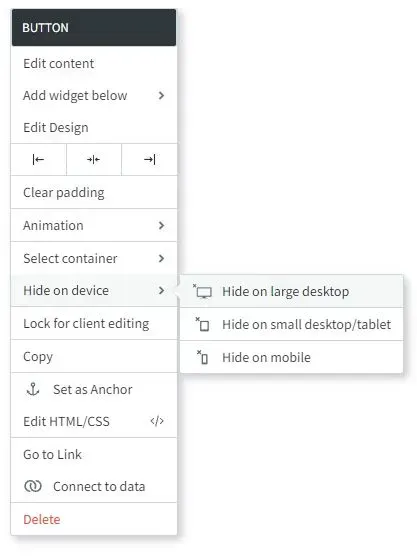
Hide-on-Device
Except for the header and footer, almost every part of the editor can be edited for each device by making the content specific to that device.
To edit content per device:
- Make a copy of the content you want to be device-specific. Right-click on the widget, click copy and then paste.
- Right-click on one of the widgets, choose to Hide on device, and then select the device where you want the widget to be hidden. For example, setting a button to Hide on Desktop, hides the button from the desktop but displays it on tablets and mobile sites.
- Click on the original content and choose Hide on device. Then, hide the content on the device(s) where you don't want it changed. For example, if you set your copy button to Hide on Desktop, you would also set the original button to Hide on Tablet and Hide on Mobile. So, you'll have two different buttons: one on your desktop, and another on your tablet and phone.
- If you want the content on all three devices to be different, you can copy it again (so you have three copies of the same content) and have a different button shown on each device.
- You now have two (or three) pieces of similar but distinct content, each shown on a separate device. Any future updates to this content will only impact the device on which it is set to display.
Edits That Do Not Affect Other Devices
Several adjustments in the editor can be changed without having any effect on mobile. They are as follows:
- Spacing (Margins and padding)
- Positioning
- Width
- Height
- Site/Page background
- Font size (it will not affect text that has been edited on mobile before)
- Changing the header or footer on the tablet view has no effect on the desktop or mobile view.
If you make changes in each device view, it will affect the view of other devices.
You can make various changes to settings without impacting other devices. These displays with Edits only affect this device icon in the editor.
Widget-Specific Changes
While some widgets are compatible with all devices, there are significant variances across devices that need a different set of features or design preferences for each device.
Below is a collection of widgets with design recommendations and tips for customising specific widgets for certain devices.
Background Images
Because the aspect ratios of different devices are so different, it's important to be careful about how you design images on your website.
For example, a full-page background on a row might look great on a desktop device but terrible on a mobile device. This could be because images with a wider width work better on desktop devices than on mobile devices.
In the global design settings, you can set a different Page background for each device. It's best to use a wide background image for desktop and a narrow one for mobile or tablet.
Slider Widget
The images you chose for the desktop version of the slider widget may not look as good on a tablet or desktop, just like the background image. It's recommended either:
- Change the size of the frame so that the slider will work on mobile or
- Hide the slider on the desktop and instead make a version just for mobile.
Images and Icons Widget
In the mobile version, the size of the image widget is not changed automatically. It's important to check your mobile devices where the image widget is used and make any necessary changes to fit.
Hover Effects on Tablet/Mobile devices
Tablets and mobile phones don't have a hover effect at all, unlike desktop computers. On tablets and mobile devices, hover layouts and options don't work.
Maps Widget
The Map widget can be set to show as a button or a map based on the device.
Contact Forms Widget
On mobile, contact forms will always have one input per line.
vCita Widget
On the device of your choice, you can set the vCita online scheduling widget to only show a button.
Considerations
Before you publish your website, make sure to check all views when you are editing widgets that are specific to a device. Using the Hide on Device option makes it easy to lose widgets.
Read this article
to learn more about switching views.


Love My Online Marketing has 10+ Years of working alongside businesses and helping them grow. Discuss your options for online success from website Design and Development through to Google Marketing.
Do you want more traffic and business leads?
Love My Online Marketing is determined to make a business grow. Our only question is, will it be yours?


