Crown Street, Wollongong, 2500

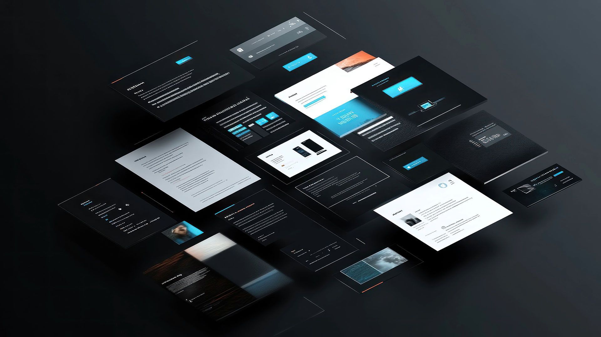
Headers
Melody Jaimon • December 5, 2022
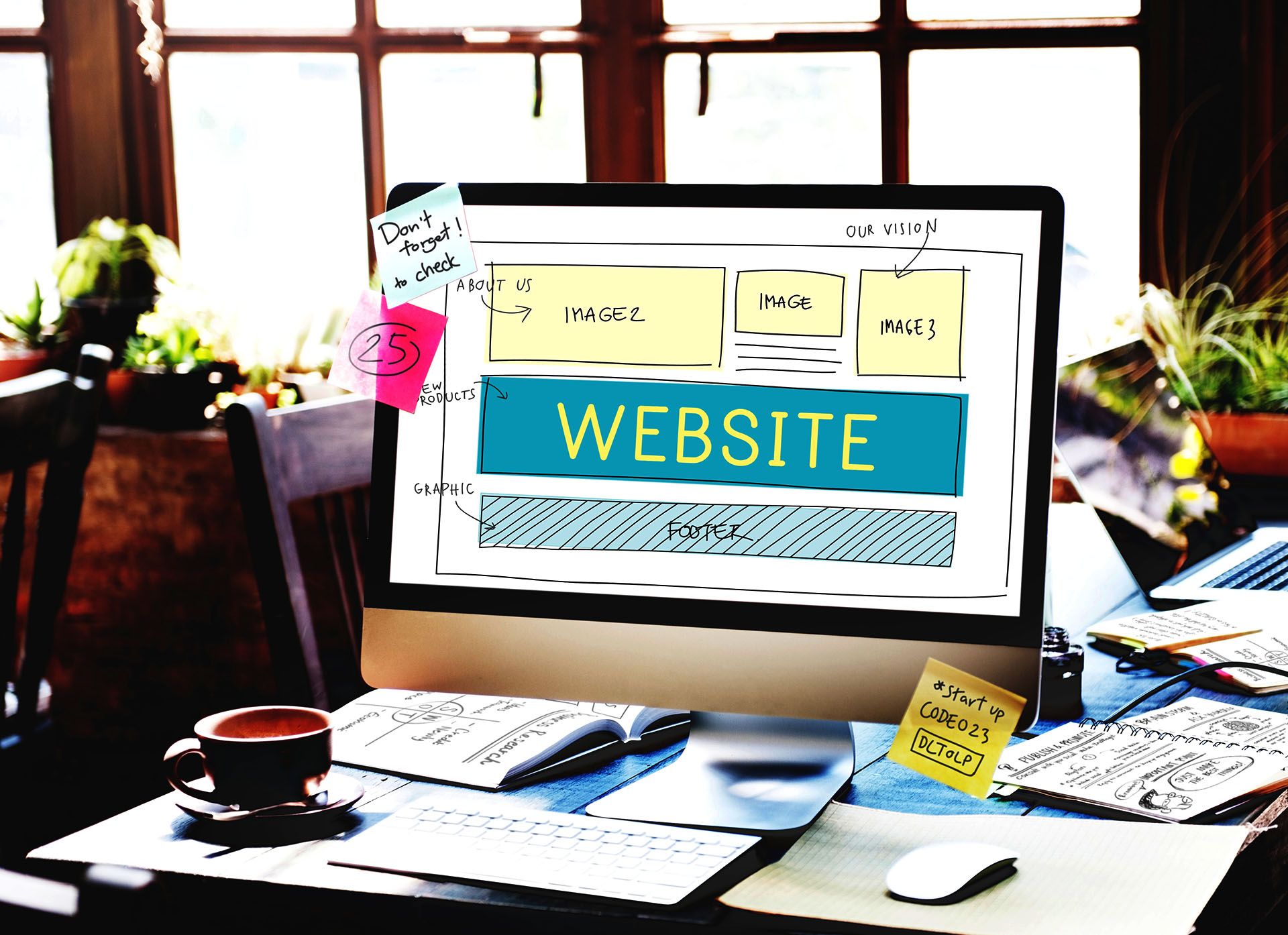
The header of your website comprises the logo and navigation. There are many ways to adjust the design of your header to assist you in creating an appealing header for your site.
The mobile header has a set design that cannot be changed. To change the content of the mobile header, follow these steps:
- Click Mobile view & edit in the top navigation bar.
- To edit the material in the header, click it.
Header Types
There are three kinds of headers: flexible, fixed, and sticky.
See the video below for further information about headers:
Flexible Headers
To customise a header, it must first be converted into a flexible header by converting the header into a row. By default, the header in most templates is a row. However, with some older themes, the header is fixed and there are just a few modification possibilities. Templates with fixed headers generally contain widgets in the header by default, such as social network links or a phone number. These widgets, however, are fixed and cannot be moved like widgets in regular rows. You can add or update widgets in the header by converting it to a row.
If you change your header from fixed to flexible and then decide you want it to be fixed again, you won't be able to change it back.
To make a header flexible and transform it into a row, do the following:
- Hover over the header and click Header.
- Click the Convert header to a row option on the Content tab.
In the majority of current templates, the header is a row by default, therefore this issue is only likely to arise when using older templates with fixed headers.
Fixed Headers
Headers are fixed in some of our older templates. This signifies that the header is locked and cannot be modified by adding widgets from the Widgets section.
Shrinking Headers
Shrinking Header is a smaller version of the site header that keeps vital navigation information constant without confusing viewers as they scroll. It's a sticky header that shrinks logos and other header widgets. It helps web pages with wide headers and extensive scrolling.
On both the Desktop and Tablet views, the shrinking header is accessible. When a header is changed into a row, the option to shrink it becomes available. It is not accessible if the header is not a row and the template has a fixed header. See
Headers for further details.
Visit
Shrinking Headers for further information on how to configure shrinking headers.
Header Layouts
To change the header layout, do the following:
- Hover your mouse over the header and click Header.
- Choose a new header layout from the Design tab. When you choose one of these layouts, fixed headers become flexible headers. Using pre-designed headers allows you to save time while building your website. You can always choose a layout and then change it later.
Selecting one of these layouts removes any current information from the header area, so make a backup before proceeding. When one of these layouts is used, the header becomes flexible and cannot be changed back to a fixed header.
Sticky Headers
To make a header sticky, hover over it, click
Header and then choose
Set As Sticky Header. When you go through your site's pages, the header becomes static and remains in place.
Hide Headers
To hide a header from a page, do the following steps:
- Click Header after hovering over the footer's bottom.
- To hide the page header on a specific device, click Hide page header on that device.
To make the header visible again:
- The Unhide Elements icon is located in the Settings section of the side panel.
- To unhide the header, click the Hide symbol at the bottom and choose Yes.
See
Show Hidden Elements for further details.
Header Logo
If the header has only one image, the site's logo will be kept while switching between header layouts. If there are many images or the logo is textual, the logo image is kept as it is in the layout.
If you delete the logo, re-add the image to the header by dragging the image element back into the header, then change the link to return to the homepage. See
Image Widget for additional details.
Other Header Options
Other header options are available in the design menu, allowing you to further modify the look of your header.
Hover over the header, select
Header, and then click the Design tab to open the header design menu.
Click
Overlap the first row to display header elements above hero images. This increases the prominence of your hero images and makes it easier to construct attractive, modern websites. Remember the following:
- For the header. Set the background colour to transparent or to a colour that has opacity.
- For the first row. Use top padding that is the same height as the header or close to it.
When you switch to a new header layout with social icons, the icons show up the way they are set up in the content library. If there are no social links, the social icons remain as generic as in the layout.


Love My Online Marketing has 10+ Years of working alongside businesses and helping them grow. Discuss your options for online success from website Design and Development through to Google Marketing.
Do you want more traffic and business leads?
Love My Online Marketing is determined to make a business grow. Our only question is, will it be yours?


